Android
Rating distribution3.85of 5
- 22%
- 55%
- 13%
- 6%
- 4%
Rolling 30-day window · ~650 reviews captured.
For the full experience, view on desktop.
Consumer IoT companion app · 2024–2026
Reframing a legacy IoT companion app from feature-driven tool to a system for retrieving footage under pressure.
Thinkware Dash Cam LINK is the companion application for Thinkware's in-vehicle dash cameras, used by more than 100,000 drivers globally. The product had been built on a legacy architecture and had received multiple incremental updates over the years to support new camera models. While it retained a stable user base in the dash cam — "black box" — market, those layered updates on top of an outdated technical foundation produced increasing system fragmentation, and the app struggled to meet modern expectations for connection speed, responsiveness, and overall usability.
I joined as the sole UI/UX designer on the BA team in our Vietnam R&D office, owning the redesign end-to-end and aligning closely with stakeholders at Korea HQ.
The fragmentation showed up to users as inconsistent connection behaviour, slow video loading, and exposed technical configuration that they had no reason to understand. Visual polish alone wouldn't help — the friction lived deep in the system, not on the surface. The legacy folder-based "by-day" gallery, the rigid connection setup, and unstable thumbnail loading on hardware-constrained devices were all symptoms of the same underlying problem.
Legacy core
Outdated technical foundation, unchanged through every layer above
The reframing came from looking at how dash cam usage actually works. People don't sit with the app every day. They reach for it in critical moments — after an accident or an unexpected incident — and what they need in those moments is simple: connect quickly, find the correct video, retrieve it without friction.
Dash Cam LINK is not a UI problem. It is a system problem.
That sentence reset the whole project. We stopped treating the app as a "video management tool" and started treating it as a system for retrieving the right footage under pressure.
Once the framing was clear, success metrics had to follow. I discussed with the team and decided to split every candidate improvement into Painkiller (core value) and Vitamin (supporting value):
That meant moving the project's success criteria from feature completeness toward time-to-retrieve, from visual polish toward reliability, from navigation depth toward direct access. Visual changes (for example, a dark-to-light mode shift) were deliberately deprioritised because they didn't address the core performance problem.
Before redesigning anything, I mapped the full user → system → constraint flow: open app → connect → view video, against the underlying system processes (scan, handshake, fetch) and the bottleneck points where each process commonly failed. Three points of friction surfaced — slow camera scan, unstable connection, and load delay — all rooted in the legacy foundation rather than the interface.
User action
what the driver does
open app
connect
view video
System process
what the app runs underneath
scan
handshake
fetch
Bottleneck
where the legacy foundation breaks
slow scan
unstable connection
load delay
Bottleneck notes
Slow scan
Legacy foundation can't parallelise device discovery — Wi-Fi enumeration stalls on multi-camera setups.
Unstable connection
Bluetooth handshake drops when the phone backgrounds the app, forcing manual re-pair.
Load delay
Thumbnail decode blocks the gallery thread on hardware-constrained devices, freezing the list.
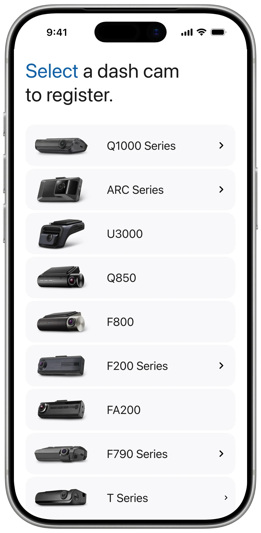
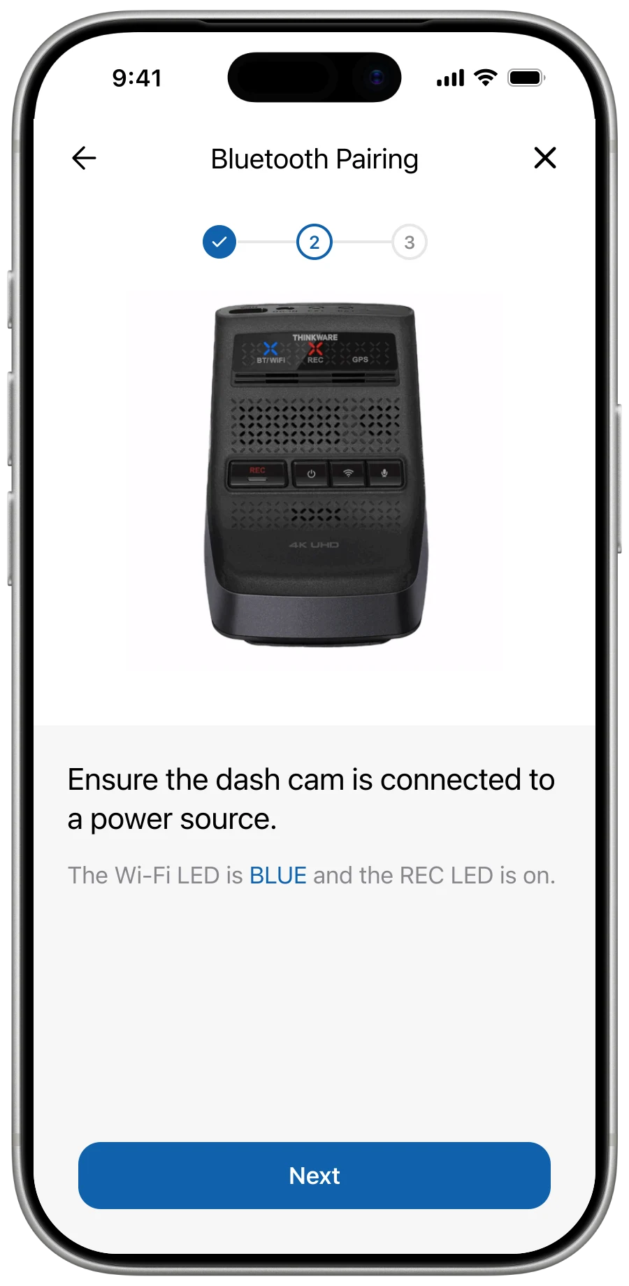
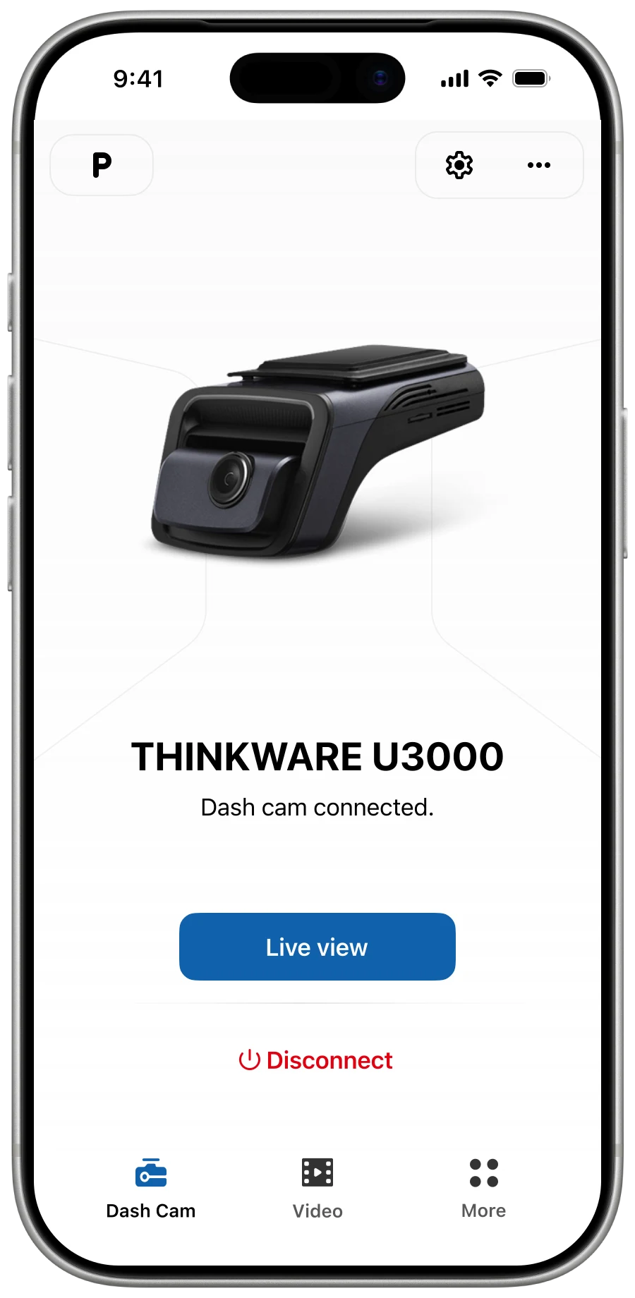
Guided step-by-step instructions with clear annotations to reduce confusion across multiple connection methods (Bluetooth, Wi-Fi, QR code) and varied camera models. Auto-reconnection for Bluetooth-paired models. Explicit error handling — every edge case mapped to specific feedback so users are never left without guidance.
More edge-case logic for engineering to maintain, but no silent failure for the user.
Activity flow
Branches
Previously paired Bluetooth cameras skip Scanning, Discovered and the Connection guide — straight to Pairing on app launch.
Stalled scan offers a Help branch with model-specific instructions and connection-method picker.
Each error mode has a specific labeled cause and recovery steps; once resolved, the flow loops back to Pairing rather than restarting from Idle.
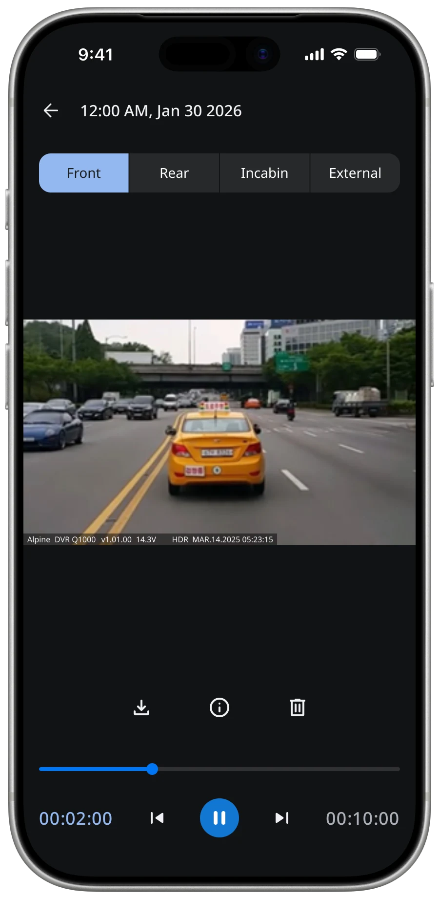
 Dash Cam
 Video
Video More
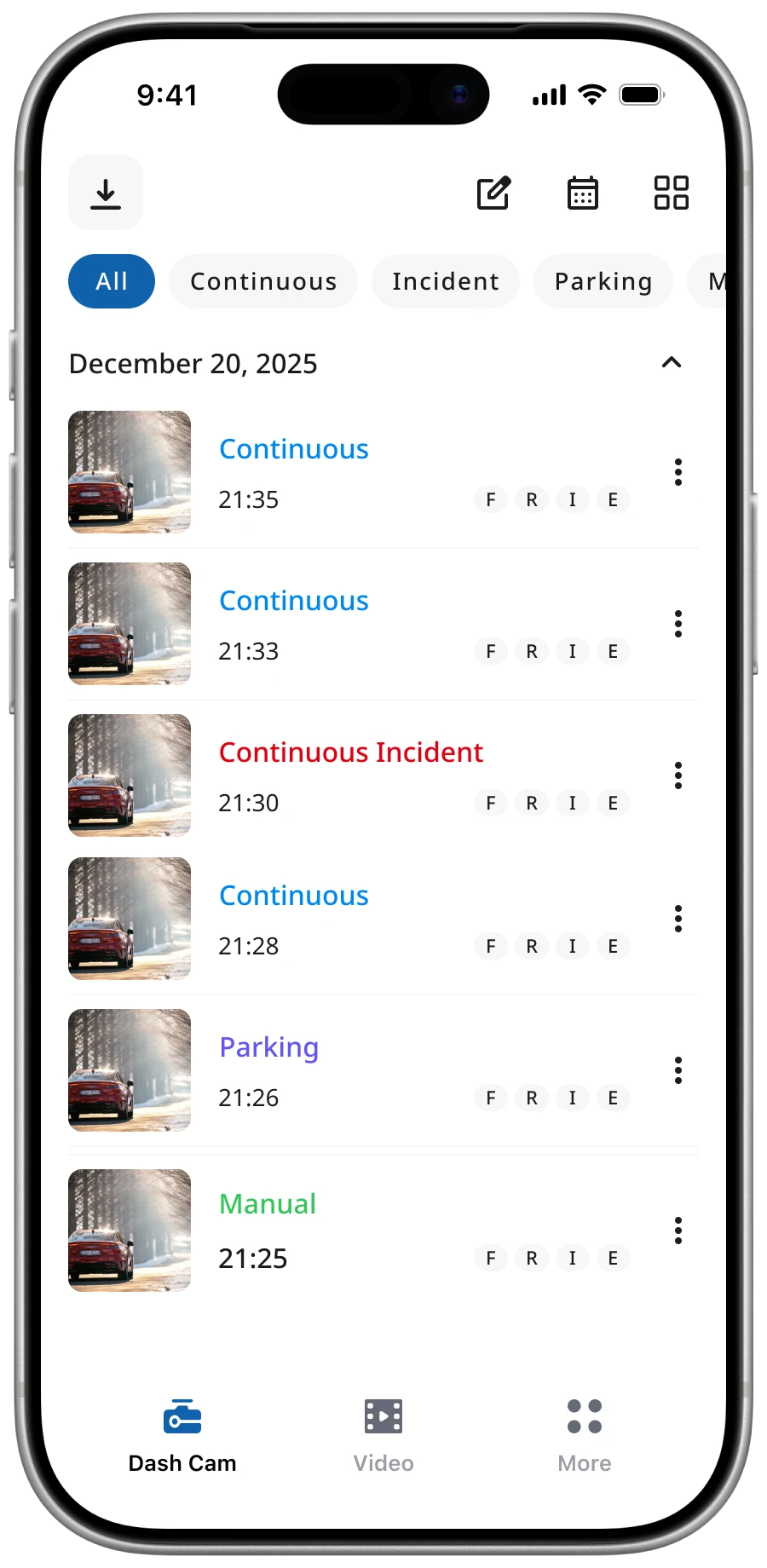
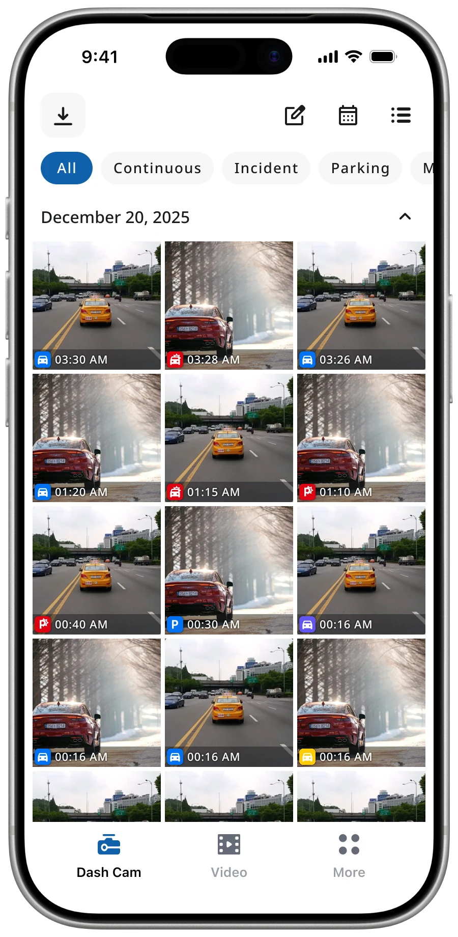
MoreReplaced the channel-first information architecture with an event-first one. The legacy gallery grouped clips by camera angle — Front, Rear, Interior, Exterior — so the same date, time, and event tag repeated across every tab. During an incident, users want to see what the moment captured, not which camera caught it. Promoting event to the primary unit and demoting channel to a tag collapses the four parallel timelines into one and removes the metadata duplication.
Routine browsing by angle takes one extra tap, but incident review — the case that matters more — drops from a multi-tab walk to a single unified timeline.


Dash Cam LINK's audience skews older — mid-aged drivers using the app on their phone in a parked or moving vehicle, often through reading glasses. Default mobile typography wasn't built for that. We shipped a system-driven dynamic font scale that respects each platform's accessibility setting (iOS Dynamic Type, Android Font scale), and pushed contrast ratios to AA / AAA against WCAG 2.2 across both light and dark modes. Every list, control and dialog flexes from x0.85 (compact) through x1 (default) to x1.5 (accessibility large) — and the typography tokens carry the scale, not the components, so a single source of truth drives every screen.
Wider testing matrix and more responsive-layout work — but the audience that opens Dash Cam LINK in moments of stress can read it without zooming or squinting.
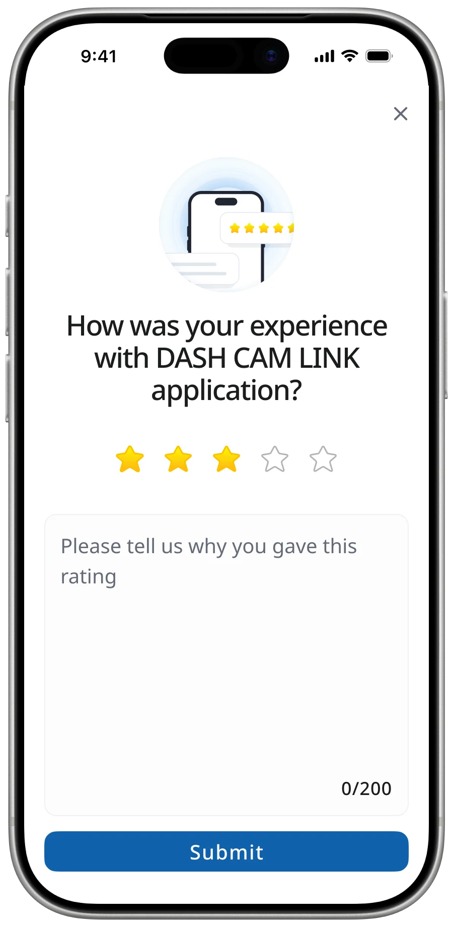
Store reviews are noisy, lossy and dominated by a 5-star prompt the user mostly dismisses. We built an in-app rating module that captures structured feedback at the moment friction happens — paired with a short comment field and contextual metadata (platform, app version, last completed flow) so customer support and the BA team can triage without re-asking the user. With a 100K+ user base, the channel now produces 600–1,000 reviews per month — first-party signal that drives release-to-release priorities, and the source behind the 70% / 60% satisfaction numbers in the Outcome below.
Storage, moderation and triage cost — traded for first-party signal we can act on each month, instead of fragmented store-rating noise.
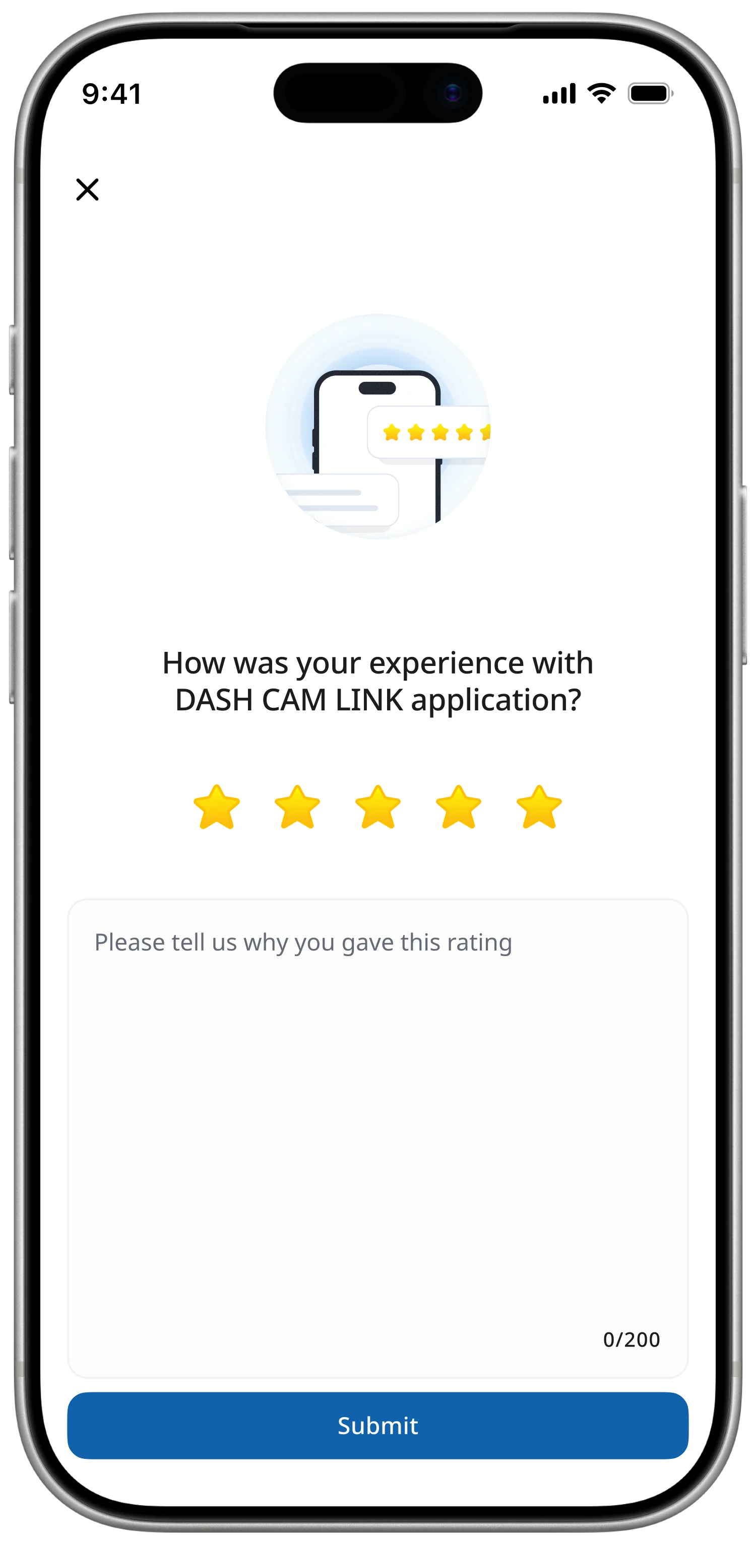
Rolling 30-day window · ~650 reviews captured.
Rolling 30-day window · ~420 reviews captured.
I built a new design system using Material Design as the baseline to support both Android (Kotlin) and iOS (SwiftUI) efficiently, with Noto Sans for consistent multilingual support. The choice was driven by maintenance and scalability — reduce design and development complexity, ensure cross-platform consistency, enable faster iteration during the rebuild — not by aesthetics. Production tokens for Spacing, Typography, and Color were defined as Figma variables.
System fidelity over visual novelty
Stay true to MD3 baseline — UI is not where this product wins.
Android-first, iOS-aligned
Tokens validate on Kotlin first; SwiftUI inherits unchanged.
Refactor, don't rewrite
Components map onto legacy code so the UI ships in place.
Color · derived from #1062AD
Typography · Noto Sans
Alongside the redesign, I produced end-to-end UX documentation across the system — connection flows, retrieval flows, error states, edge cases — addressing the absence of any prior UX documentation and creating a shared reference for the design and development teams. Audited 100+ existing screens and redesigned the interaction design for connection and retrieval flows.
The redesign held user satisfaction steady at scale while addressing structural debt that had been accumulating for years. Maintaining 70% Android and 60% iOS ratings through a structural rebuild — not a visual refresh — is the part I'm most proud of. The new foundation now supports future improvements in connection performance and feature expansion that the legacy architecture could not.
The lessons I took from this project are practical: system thinking is essential when technical constraints directly shape experience; not every UX problem can be solved at the interface level; and designing under constraints is about prioritisation, not optimisation — focusing on the core task to avoid over-investing in non-critical improvements.