Consumer IoT — action camera companion app · 2025–2026
XIAN Action Camera
Bringing structure to an undefined R&D product — defining the user moment that matters before designing any feature.
- Client
- Thinkware (South Korea)
- Role
- UI/UX Designer of BA team
- Outcome
- PRD / R&D phase — UX foundation, design system, product direction
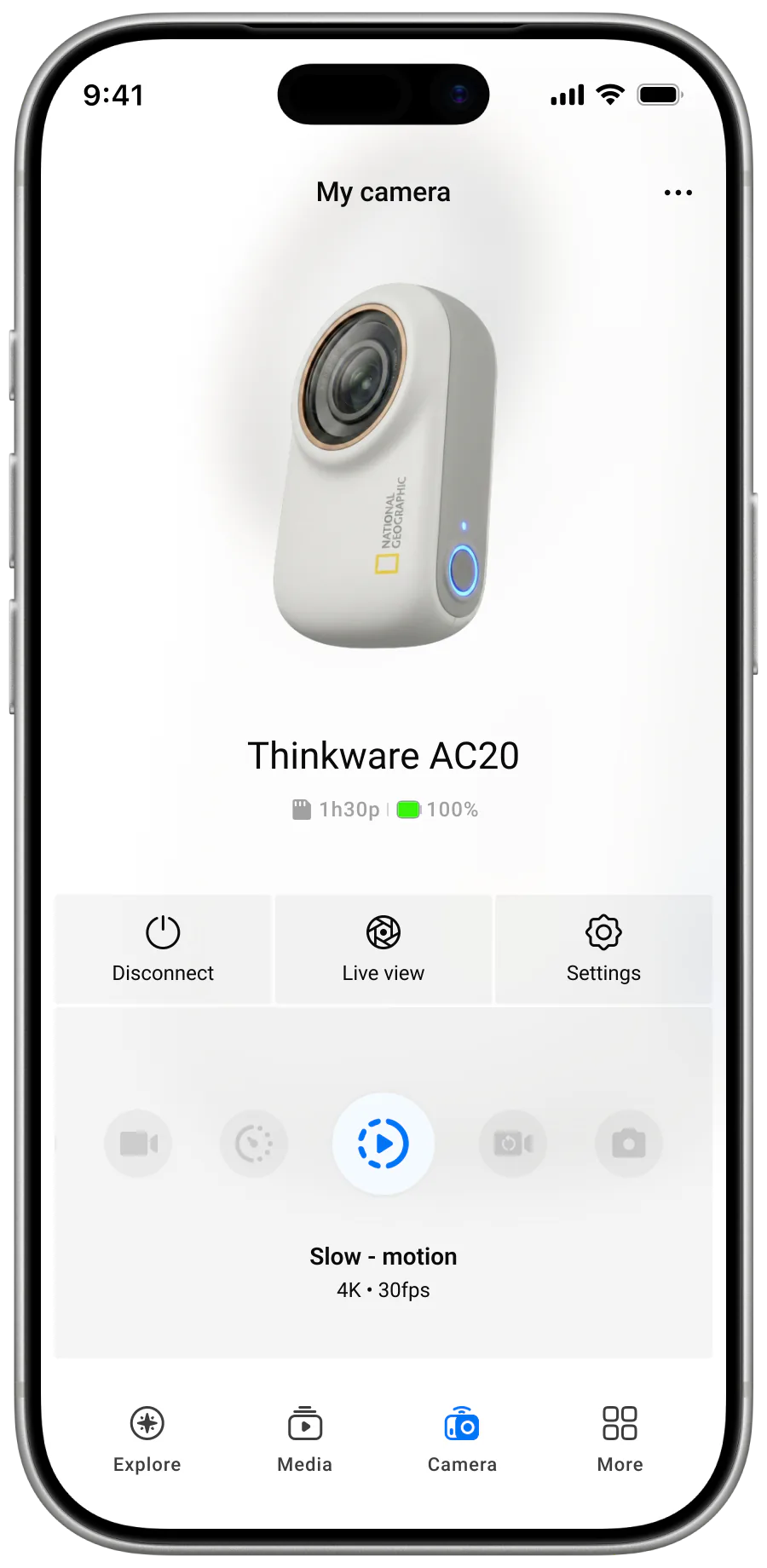
Context
XIAN is a new action camera companion app being developed in parallel with the camera hardware in Thinkware's R&D pipeline. I joined as the sole UI/UX designer, working closely with the BA team in an environment where requirements were still loose, hardware was still evolving, and the firmware contract was being negotiated through an outsourced partner whose own delivery cadence kept shifting.
This is my second IoT project at Thinkware, after Dash Cam LINK. Where Dash Cam LINK was about restructuring a legacy product, XIAN is about defining one before it exists.
Problem
At the early stage there was no clearly defined product direction. The feature set was being influenced by multiple references — particularly GoPro and Insta360 — without a clear understanding of who the target user was or what the core value of XIAN should be. Over time the product began to position toward non-professional users for casual content creation, but that direction wasn't yet consistently reflected in product decisions.
The challenge wasn't designing features. It was bringing structure to an undefined and constantly shifting system, while five compounding frictions made every decision feel like building on shifting ground: unclear product direction, feature expansion without focus, lack of UX foundation, evolving system constraints, and limited data and alignment.
- 01
Unclear product direction
No defined target user; the feature set was shaped by GoPro and Insta360 references in parallel.
- 02
Feature expansion without focus
Features accumulated through reference comparison, ahead of agreement on the product's core value.
- 03
Lack of UX foundation
No prior flows or behavioural patterns for this category — interactions had to be defined alongside the product.
- 04
Evolving system constraints
Firmware was delivered by an outsourced partner and kept changing under the design.
- 05
Limited data and alignment
No baseline usage data, and the new positioning hadn't yet shaped day-to-day product decisions.
Insight
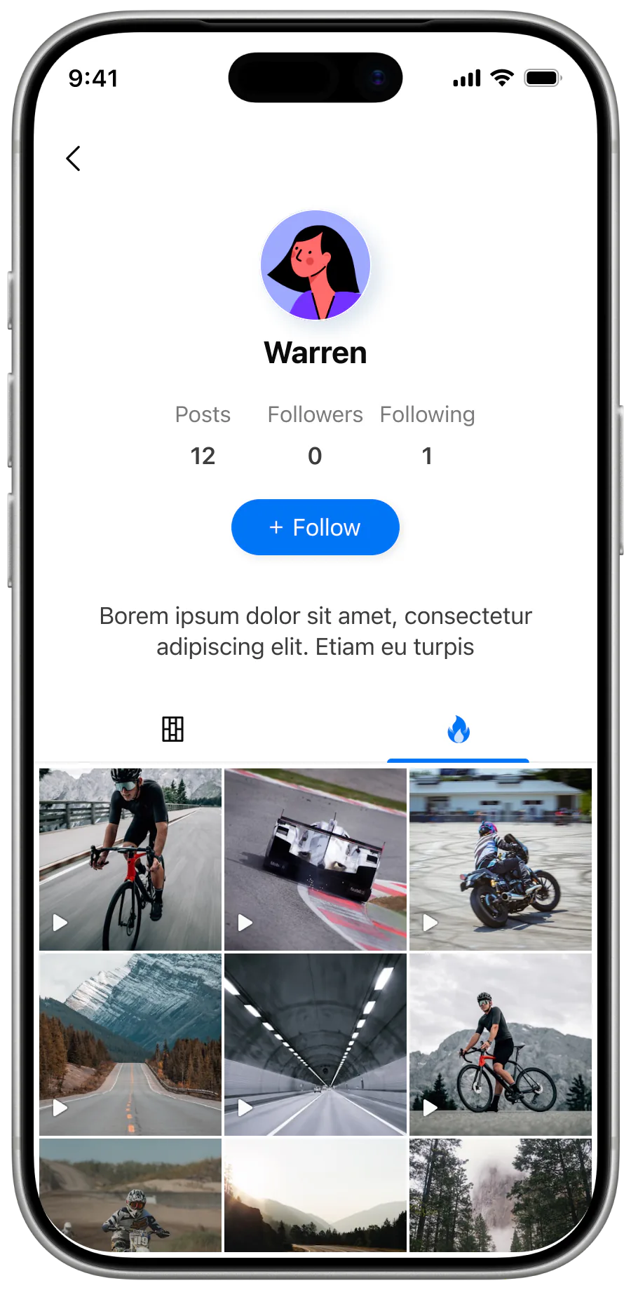
I started from the user moment rather than the feature list. Non-professional users don't engage with action cameras as a system of features. They use them in short, spontaneous moments where a good shot matters more than configuration. The most important moment isn't during recording — it happens right after, when users realise they've captured something worth keeping.
Users are not looking for more control — they are looking for a faster way to capture and keep meaningful moments.
That single sentence let us deprioritise a long list of speculative features and centre the design on three core flows.
System thinking
I analysed XIAN as a multi-layered system rather than an app. Four components, each with their own constraints:
- The user, expecting fast and simple interaction.
- The app, the interface and intermediary between user and hardware.
- The camera hardware, with evolving firmware delivered by an outsourced partner.
- The storage layers — SD card, app storage, phone gallery.
Component 01
User
Non-professional. Expects fast and simple interaction in spontaneous moments.
Component 02
App / Interface
Intermediary between user and hardware. Carries the system feedback the user sees.
Component 03
Camera hardware / Firmware
Evolving hardware spec. Firmware delivered by an outsourced partner under negotiation.
Component 04
Storage layers
SD card · app storage · phone gallery. Footage moves across all three.
Data path
Footage on the SD card → transferred to the app on connection → exported to the phone gallery for sharing. Every step introduces latency, dependency, and potential failure.
The data flow runs across all of them: footage on the SD card → transferred to the app on connection → exported to the phone gallery for sharing. Every step introduces latency, dependency, and potential failure. The constraints I had to design around were connection instability, slow and unreliable data transfer, and lack of system feedback that left users uncertain whether downloads had actually completed.
SD card
App on connection
Phone gallery
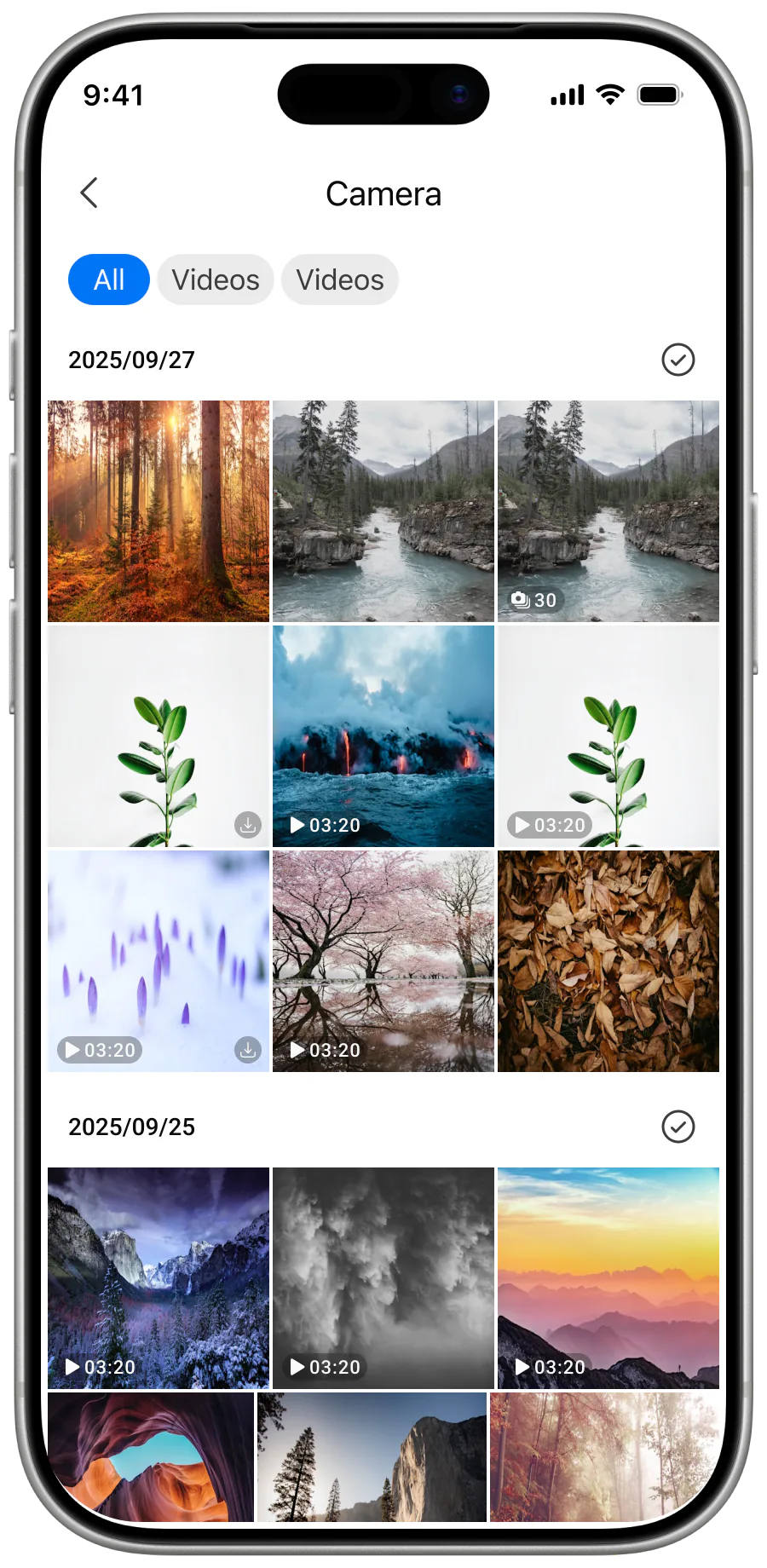
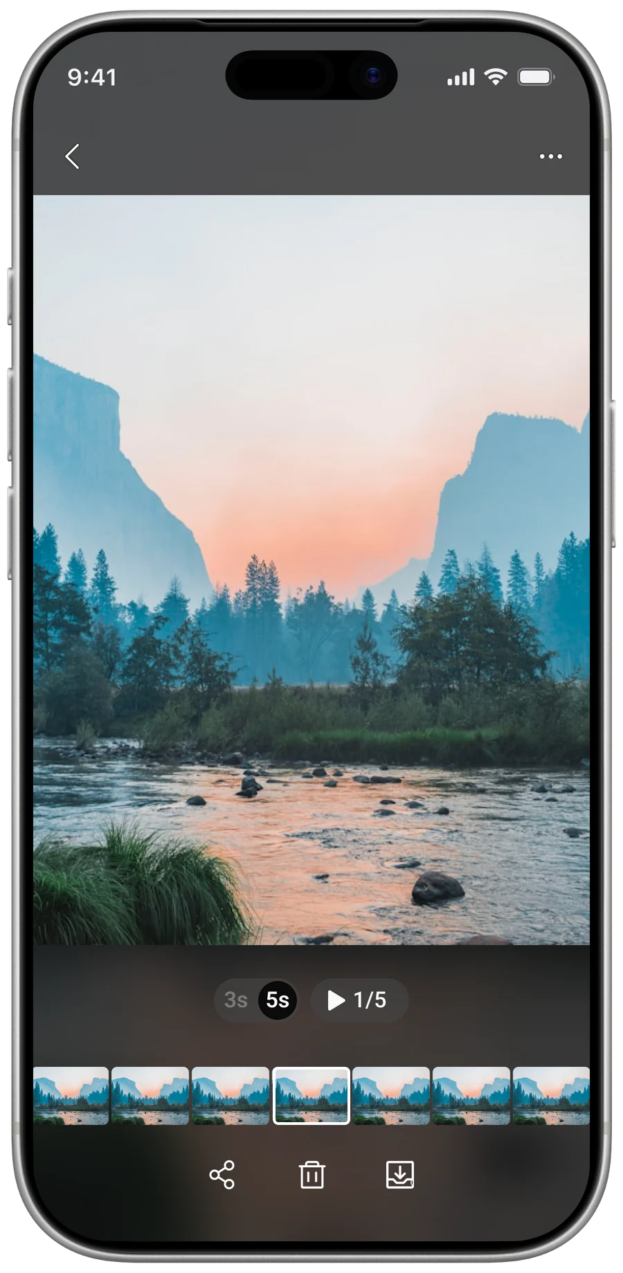
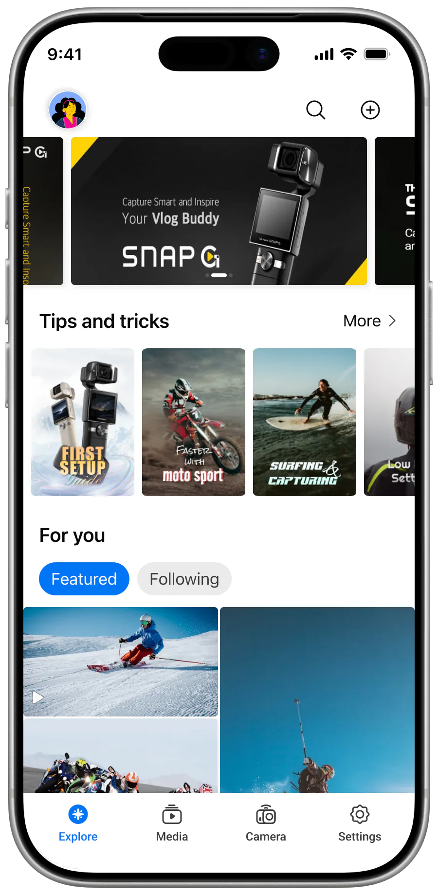
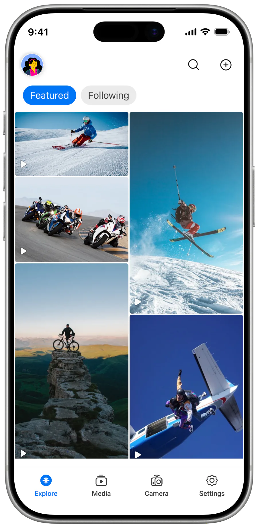
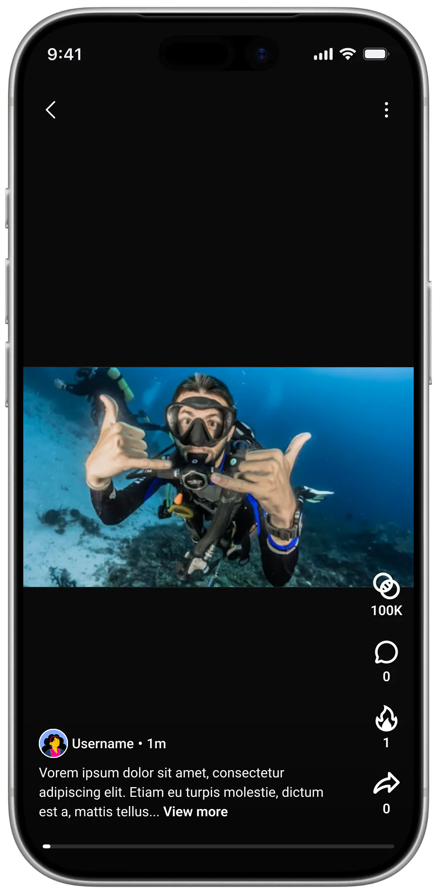
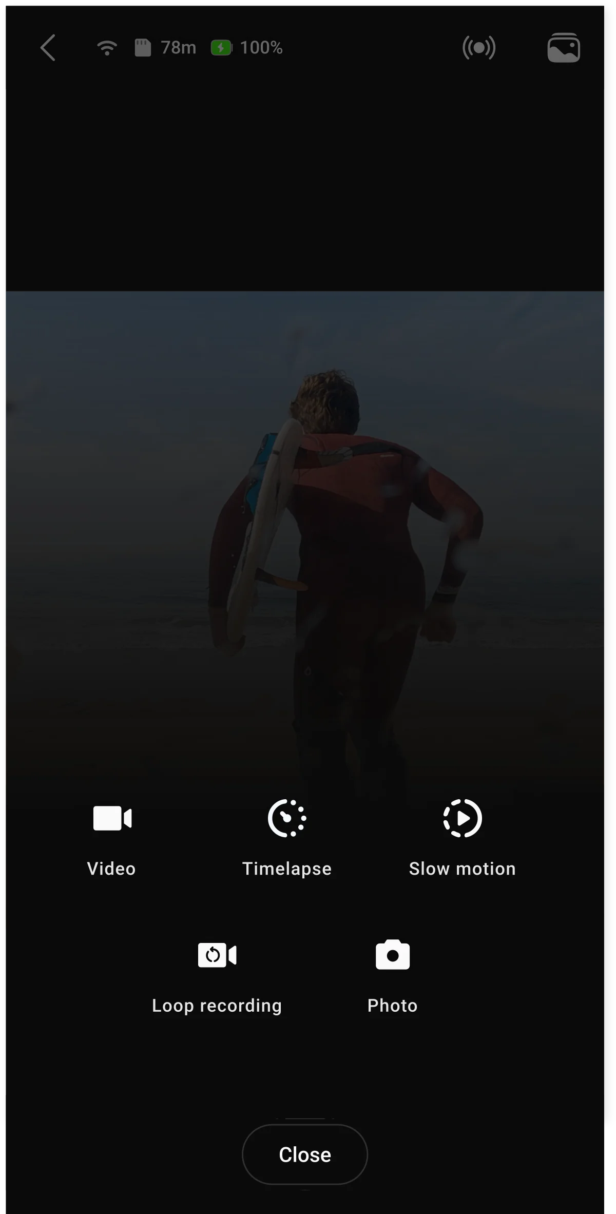
Three core flows became the experience anchor — connecting to the camera, capturing content, retrieving and saving media. Editing and community features were explicitly deprioritised as secondary so they wouldn't interrupt the core flows.
Discussion and suggestions for improvement
Hide system complexity from users
Connection complexity (multiple methods, varied hardware) cannot be removed at the system level, so the design shifts complexity into the application layer. Implementation: automatic device scanning and detection, auto-reconnection for previously registered cameras, continuous and clear system feedback during connection states.
Greater system-level complexity and edge-case handling, but significantly reduced user effort and uncertainty.
Step 01
Scanning
On launch, the app silently scans nearby Bluetooth devices and surfaces any paired XIAN camera that answers.
User moment
User sees the snackbar surface a found Thinkware EGG.
Step 02
Handshake
When the user taps Connect, the app sends the pairing command and completes the BT handshake with the camera firmware.
User moment
Snackbar swaps to "Connecting…" with a live spinner.
Step 03
Connected
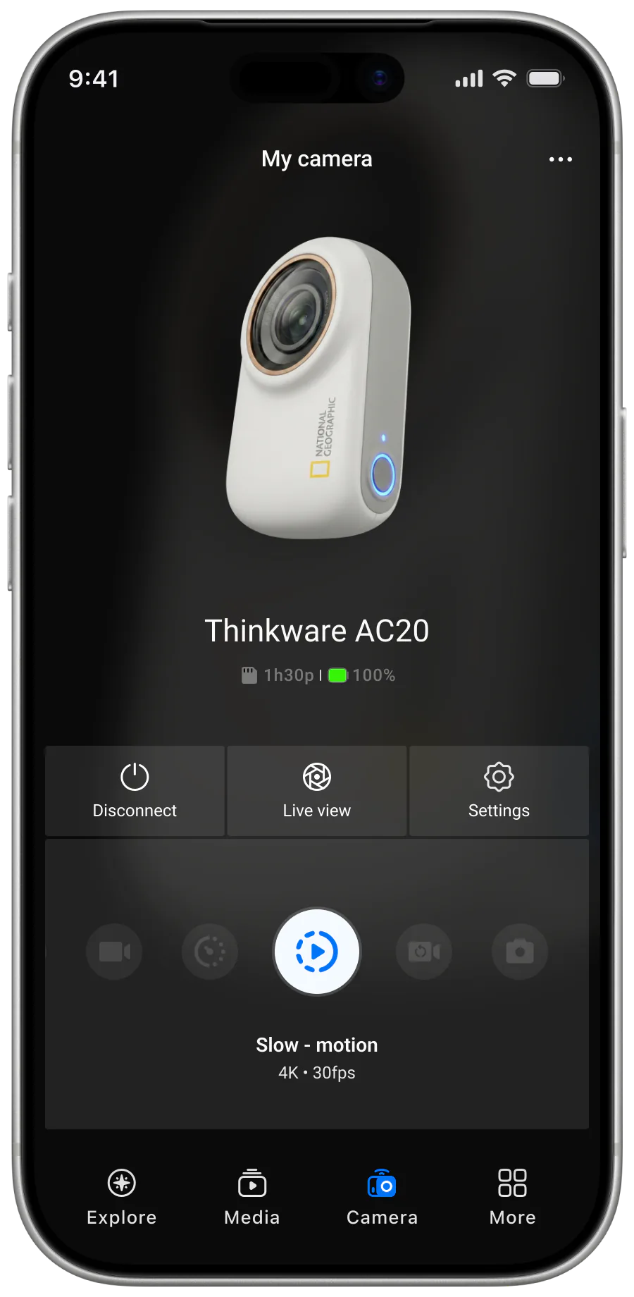
The BT control link goes live. Record, capture and mode commands route through. Wi-Fi is offered on demand for higher-bandwidth control.
User moment
Snackbar reads "Your camera is ready", then the My Camera screen takes over.
Remove blocking moments
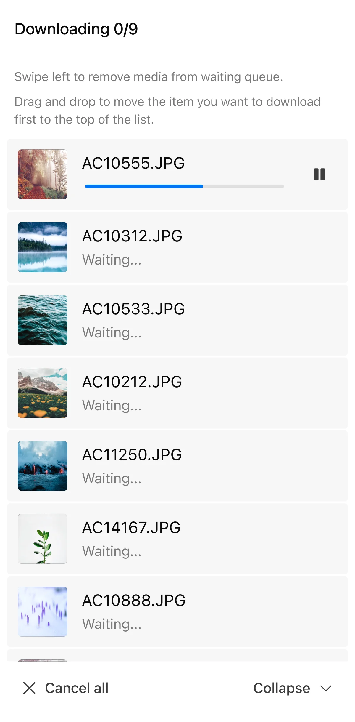
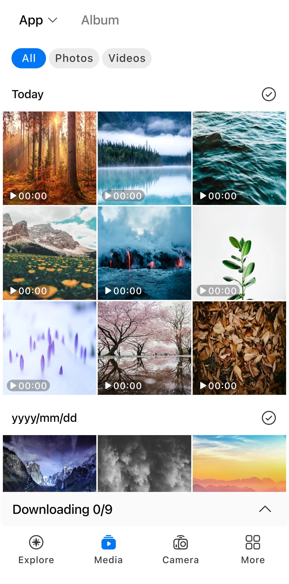
Action-cam files are heavy and the original flow asked the user to wait through every transfer. I proposed branching download into a background module — each file lands in a queue the user can reorder or remove while continuing to use the rest of the app. A deliberate step beyond Thinkware's existing dash-cam apps, where users were held behind a full transfer list before they could do anything else.
More surface to design and engineer (queue UI, priority controls, background sync) — but the user is never held still by their own transfer.
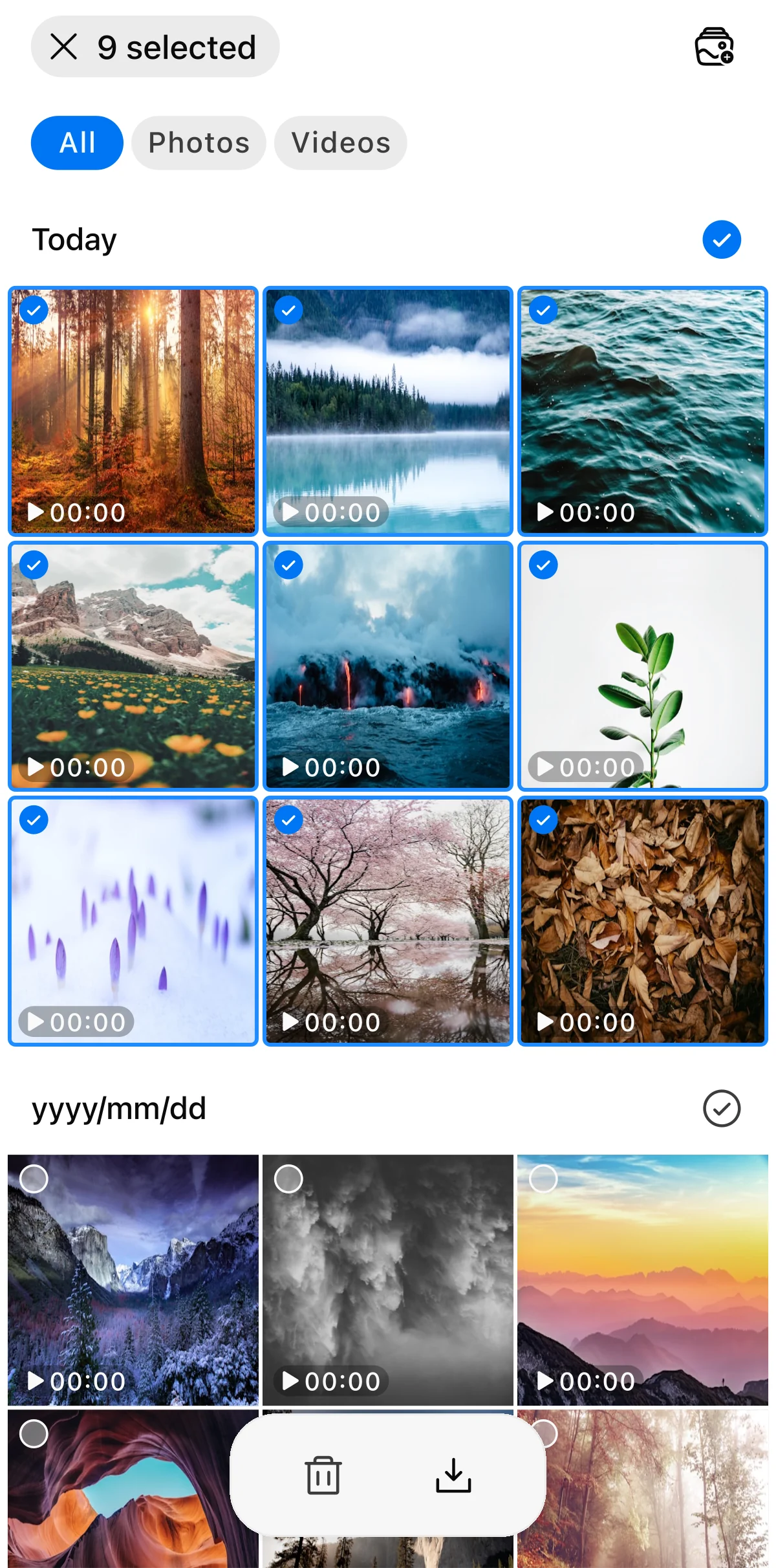
Step 01
Selection mode
User picks media in the gallery and taps Download. Nine items selected here become the queue passed to the next step.
Step 02
Downloading sheet
A full-screen sheet surfaces the queue. The user can swipe to remove an item or drag to reorder priority while the first download runs.
Step 03
Gallery + collapsed bar
Collapse drops the sheet to a bottom bar so the gallery (and the rest of the app) is usable through every transfer. Tapping the bar expands the sheet again.
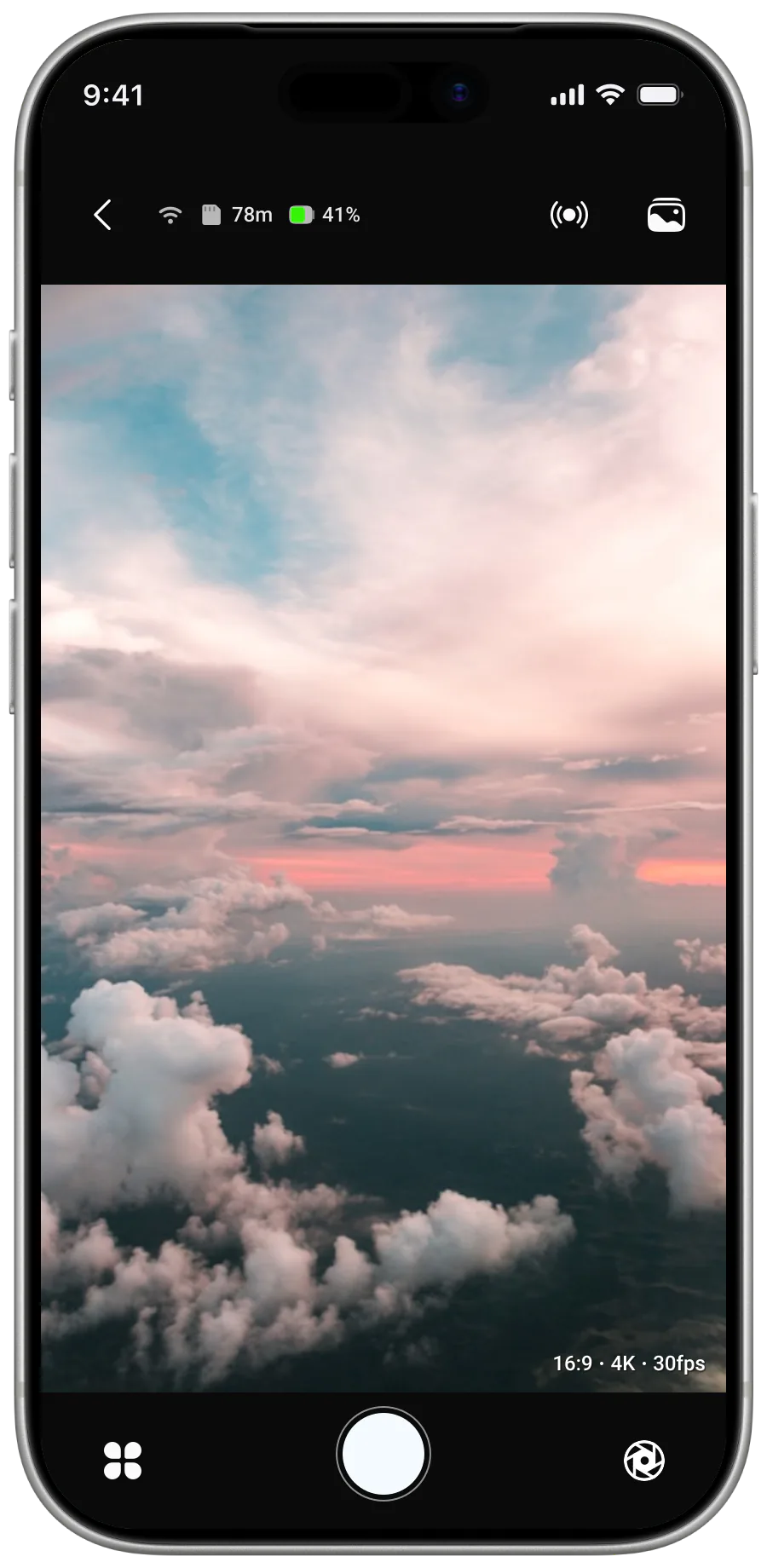
Prioritize in-app consumption over device dependency
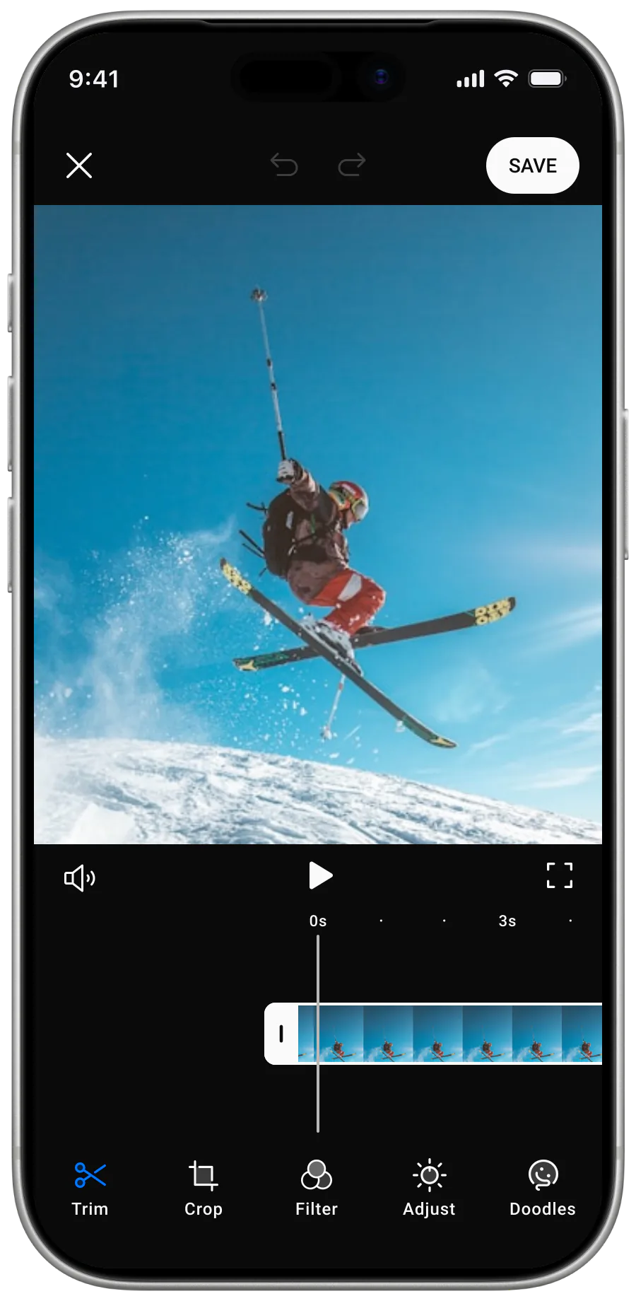
The camera's small LCD limits usability and adds friction for review. After discussing with the team, we decided to improve in-app streaming quality so users can review content directly on their phone — optimised video streaming for higher-quality playback, plus in-app preview and review.
Higher data usage and dependency on connection quality, but significantly improved usability.

Step 01
Live view
Step 02
Change mode
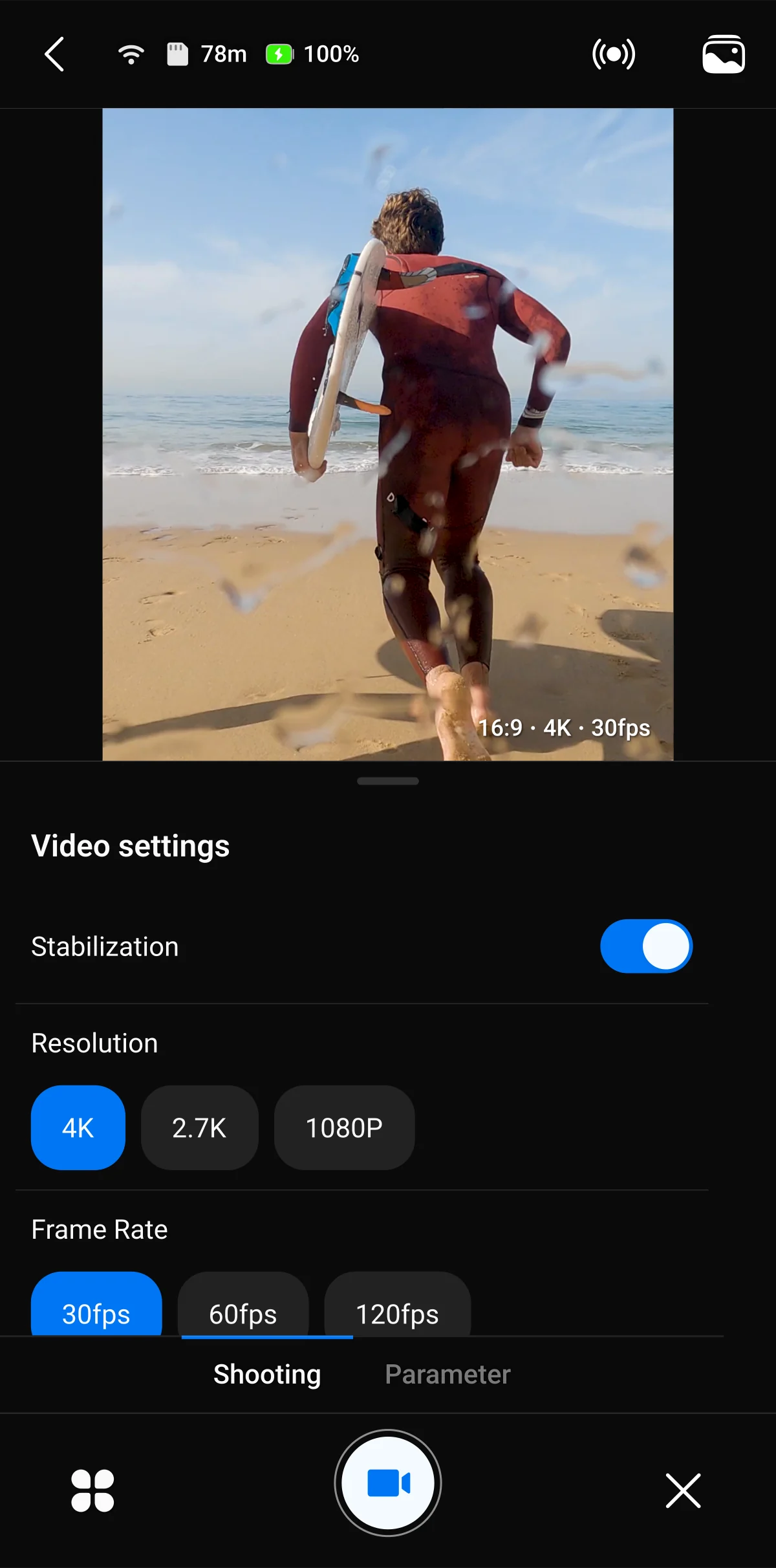
Step 03
Settings

Step 04
Recording
Execution
I conducted competitive research on Insta360 and GoPro to understand how the leaders position for prosumer versus professional users, alongside user research to ground the non-professional direction. From there I built the missing UX foundation — interaction design across camera connection, control, and media flows; a design system built for scale and cross-platform parity (Kotlin on Android, UIKit on iOS), prioritising structural stability and maintainability over visual polish; UX documentation and end-to-end flow definitions; and contributions to product direction by simplifying scope and clarifying concepts such as the in-app editor.
Connect
User → System → Outcome- Open the app
- Tap Connect
- Auto-scan nearby BT devices
- Resolve paired camera identity
- Send pairing command
- Negotiate firmware version
- Confirm BT control link is live
- Surface "Ready" to the user
Camera ready in one tap
Capture
User → System → Outcome- Pick a mode
- Tap the shutter
- Stream live preview over BT/Wi-Fi
- Sync framing telemetry
- Encode preview at app-side scale
- Trigger remote shutter on camera
- Buffer high-res footage to SD card
- Echo recording state back to UI
Capture, no camera-LCD detour
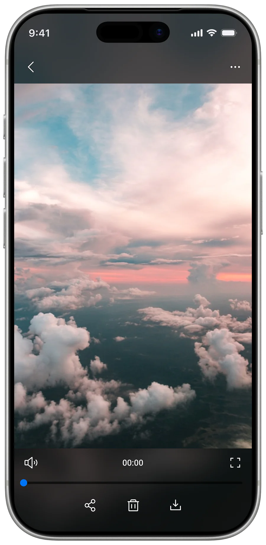
Retrieve
User → System → Outcome- Select media
- Tap Download
- Build a transfer queue
- Throttle bandwidth per file
- Resume on disconnect
- Run downloads in the background
- Write each file to the phone gallery
- Update progress on every thumbnail
Files saved while the user keeps going
Design System
XIAN's design system is built for scale and flexibility — portable across both Kotlin on Android and UIKit on iOS. Type sits on each platform's native system font so dynamic font scaling can ship later without retrofitting the foundation. Buttons, chips, data-entry fields, dialogs and lists are defined first; everything else is built off these primitives so the system stays small, predictable, and stable as the product evolves.
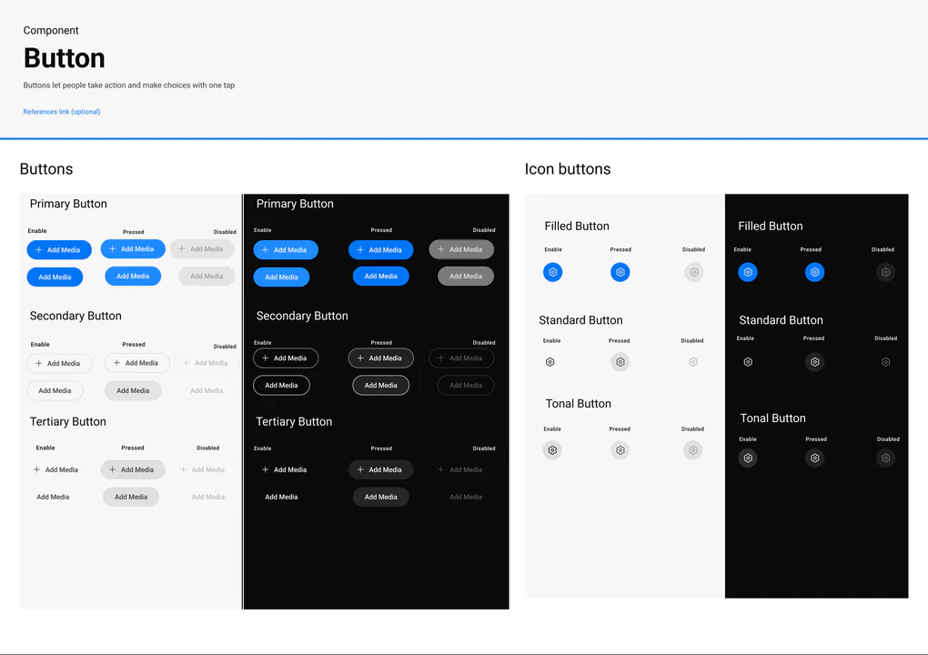
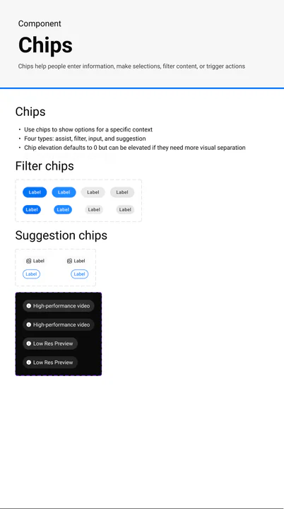
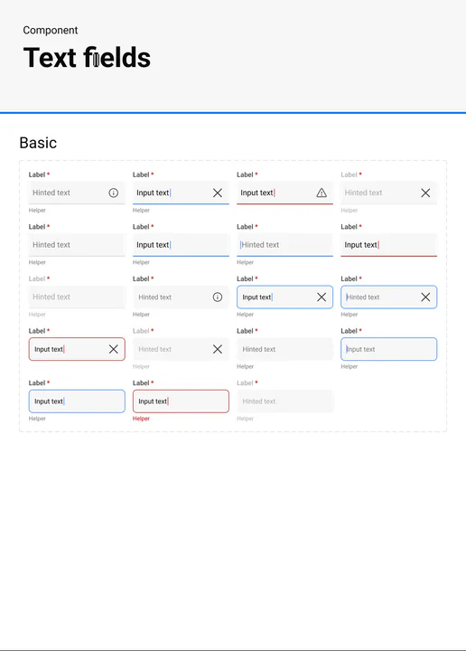
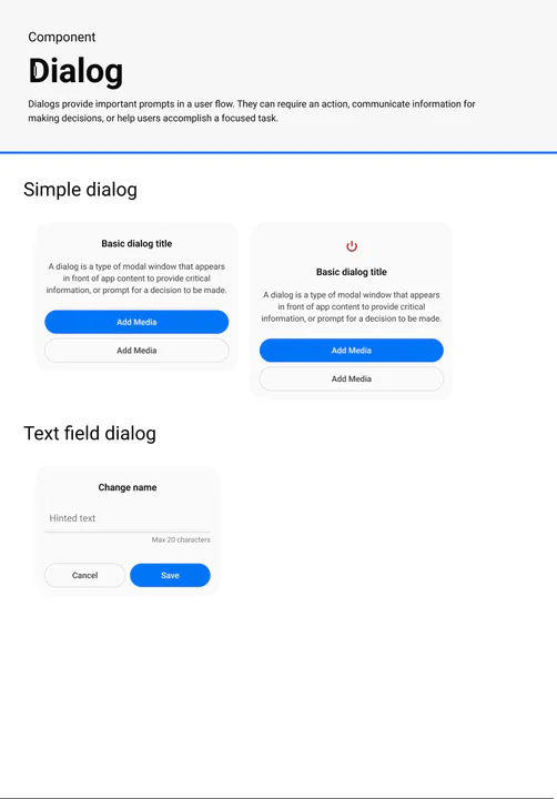
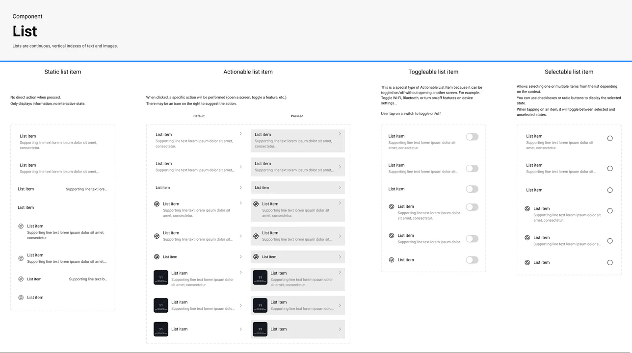
And 20+ More Components
Portable across Kotlin Android · UIKit iOS
Engineering targets are Android (Kotlin) and iOS (SwiftUI), with firmware delivered by an outsourced partner working through the PM. I also wrote SRS documents for several XIAN features — a BA-adjacent responsibility well beyond a typical designer scope.
Outcome
The outcome at this stage isn't a metric — it's a foundation. R&D continues, but the product now has a defined direction and a working system to design against.
UX foundation established
Flows, documentation, and edge-case mapping are in place. End-to-end interaction design across camera connection, control, and media flows; SRS contributions for several XIAN features.
- BG
- Surf
- Text
- Accent
Design system foundation built
Built for scale and flexibility — portable across Kotlin on Android and UIKit on iOS, with type on each platform's system font so dynamic font scaling can ship later without retrofit. Primitives first (buttons, chips, data entry, dialogs, lists); structural stability prioritised over visual polish.
- Connect
- Capture
- Retrieve
- Editing
- Community
Product direction sharpened
Three core flows — Connect, Capture, Retrieve — confirmed as the experience anchor. Secondary features (editing, community) deliberately deprioritised so they don't fracture the foundation.