PropTech — post-purchase customer experience · 2022–2023
Houseplus Post-Purchase
Research and digitize the traditional paper-based post-sale real estate workflow — designed to digitize the developer's process and address the real concerns of users.
- Client
- Smarty Process Solution
- Role
- UI/UX Designer
- Outcome
- Research-led PRD · 70+ screens designed · 4 modules · shipped to pilot


Context
A research-led engagement at Smarty Process Solution, digitising the post-purchase layer of a Vietnamese residential developer's real-estate workflow. Before the engagement, the entire post-sale lifecycle ran on paper contracts, phone-and-email payment reminders, and Excel-based tracking, sitting alongside an IBM BPM Enterprise Resource Management system that owned every business rule the app had to respect.
My job was to turn that paper-and-phone process into a digital surface a first-time home buyer could trust with multi-billion-VND transactions — without changing a single business rule upstream.
Problem
Two compounding problems drove the digitisation initiative.
First, home buyers — typically unfamiliar with paperwork-heavy purchase processes — frequently missed installment payments and submitted incorrect documents. That created customer friction and revenue collection delays, but more importantly it created a quiet anxiety that hung over the whole post-purchase experience: people were afraid of getting it wrong with money they could not afford to get wrong.
Second, paper-based contracts and ad-hoc payment workflows created compliance and legal exposure. Records lived in filing cabinets and Excel sheets. Errors were caught late, if at all.
The product needed to do two things at once: proactively guide buyers through their obligations in a clear, visual way, and give internal teams (sales, customer service, debt management) a unified system to track and resolve payment status across active customers.
The Challenges
- Ownership and handover processes are very complex and involve many special cases
- Information security is crucial — records and payment details must be safe
- The application needs to handle a large amount of data
- Working within technical constraints (existing IBM BPM workflows)
The Objectives
- Optimise processes, simplify complicated ones, automate repetitive or time-consuming tasks
- Conduct user research — surveys and interviews — to gain insights into goals, motivations, and pain points
- Work within technical constraints while still delivering an app that meets users’ needs and expectations
Design process
A human-centered design process across five phases — with Empathy and Define given more weight than typical product engagements. The brief described what the company wanted; only the research described what users feared, so the early phases carried the load.
Phase 01
Empathy
- Brainstorming
- Decks research
- Quantitative research
- Competitive research
Phase 02
Define
- Persona
- Empathy map
- User journey map
- Competitive research
Phase 03
Ideate
- How might we?
- Interaction architecture
- User flow
Phase 04
Design
- Wireframing
- Style guide
- UI design
- Prototyping
Phase 05
Test & more
- Usability testing
- Learning & results
Research
Every assumption about what users wanted came from inside the partner company — sales briefings, internal complaints, hotline transcripts. I spent the first phase finding the actual fear points before designing for them.
Quantitative — buyer profile
A survey sized the buyer population, the transaction range, and the feature priorities the partner team disagreed about internally.
Buyer age distribution
Who is searching and buying — Vietnam, 2022
- 22–2922%
- 30–3942%
- 40–4924%
- 50+12%
HCMC primary apartment supply by price segment
Share of new units brought to market in 2022
- Affordable< 35M VND/m²5%
- Mid-tier35–60M VND/m²30%
- High-end60–120M VND/m²50%
- Luxury> 120M VND/m²15%
Top concerns when buying property
Share of buyers naming each as a top-3 concern
- Legal & documentation risk68%
- Pricing transparency54%
- Developer credibility49%
- Payment / transfer mistakes41%
- Construction delay35%
Payment method used for property transactions
How money moves into and out of the deal in 2022
- Bank transfer78%
- Cash deposit14%
- Cashier’s cheque5%
- Escrow / other3%
Four data slices that triangulated the buyer: who they are, what segment they buy in, what they fear, and how the money moves. Sources noted under each chart.
Qualitative — 5 in-depth interviews
Five employees across real estate sales, customer service, and debt management surfaced friction patterns each team saw daily but none saw end-to-end. Four findings repeated:
- 4 of 5 voiced concern about providing incorrect information on a large transfer.
- The majority described long wait times and complicated procedures for document processing as a source of repeated, unintentional mistakes.
- 4 of 5 said it was difficult to contact the real estate company because the hotline was always busy with complaints.
- 5 of 5 said the main motivation to use a post-purchase app was to simplify procedures, improve communication, and reduce transaction errors.
Say & Do
- Submitting documents online via email
- Missing or incorrect documents when submitting on paper
- Receiving and signing the handover protocol when taking possession of the new house
- Reporting errors and requesting warranty service over the phone
See
- Model apartment or show apartment
- 3D view
- Architecture
Think & Feel
- Frustrated when calling the hotline and it’s always busy
- Anxious about making a mistake on a large transfer with the wrong message
- Happy about buying a new house
Hear
- Sales pitch from staff
- General information about the real-estate project and future vision
What buyers say, do, think, feel, see, and hear during the post-purchase journey. The most loaded quadrants are Think & Feel (anxiety about the transfer message; frustration with the busy hotline) and Say & Do (paper documents, phone reports, email submissions).
Synthesis — pain / needs
The Pain Points
- Incorrect money transfer information
- Difficult to contact the real-estate company
- Complicated and error-prone documentation process
- Time-consuming procedures
The Needs
- Auto-suggest transfer-message info — Vietnamese e-wallets do not support large-amount transfers
- Online appointment scheduling
- Online document submission with detailed guidance and per-customer-type categorisation
- Streamline and digitise complex procedures wherever possible
The pain is concrete: the wrong account number, an unreachable hotline, paperwork that takes a day. The needs are concrete in return: pre-filled transfer messages, scheduled contact, online submission with guidance per customer type.
Transaction value was the load-bearing finding: when a first-time buyer is moving more than five billion VND through a process they have never seen before, every other design decision has to be measured against the cost of a single mistake.
Customer journey
Before settling on solutions, I mapped the full post-purchase journey end to end — from the moment a buyer downloads the app to the moment they manage a property they already own. Every stage carries a touchpoint, a feeling, an experience, a pain point, and a candidate solution. The journey map was the artefact the partner team and I argued against most: it was easier to dismiss a single feature request than a stage that had a real frustration printed underneath it.
| Row | Outside app App install | Outside app Login / signup | Explore app Home & menu | Explore app Appointment booking | Explore app Notification | Explore app Payment | Explore app Submit document online | Explore app Submit paper document | Explore app Property management |
|---|---|---|---|---|---|---|---|---|---|
| Touchpoint | Store listing | Auth screen | Navigation, featured items | Calendar booking process | Notification tab | Payment process | Online submit process | Timeline displayed | Process timeline |
| Feeling | “Easy to find but takes a while to download.” | “Help me add a fingerprint please.” | “Is there a way to make it load faster?” | “If I schedule an appointment that conflicts with someone else’s, what should I do?” | “Is there any way to sort my notifications?” | “The message is too long and complicated — if I get it wrong, what should I do?” | “Are there any other processes that can be done online?” | “I have to travel between three locations just to submit a document.” | “If I purchase another apartment, will it be updated immediately?” |
| Experience | Download via the link provided by the company | Provided with an existing account and password | Easy to search various options | Schedule appointment via app | Receive quick notifications as soon as there is an issue | Payment via smart banking or bank transfer | Submit personal documents online | Printing, filling out information, signing, and submitting in-person at the counter | Clear and personalised apartment information |
| Pain point | Time-consuming download | Enter password every time | Can’t see the tasks that need to be done quickly | Double-booking or incorrect scheduling | Difficult to follow | Incorrect payment information | Concerns about information security | Difficulty travelling between locations | Not optimised for multiple projects |
| Possible solution | Reduce download size | Use Smart OTP or biometric security | Highlight the urgent tasks | Suggest a suitable time slot, lock already-scheduled slots | Classify notification content | Pre-written messages with correct syntax + copy function | Commitment to information security | Minimize errors so customers avoid moving around to prepare documents | Reasonable information classification |
Insight
The reframing came from looking back at the empathy map and the journey map together.
Buyers don't fear the post-purchase process. They fear getting one wrong number on a multi-billion-VND transfer.
That sentence reset the project. The brief had described a digitisation effort — replace paper, replace phone, replace Excel. The research described something narrower and more specific. The user wasn't asking for a digital version of the existing process; they were asking for a way to not make a costly mistake inside it.
That distinction changed which features carried weight. A modern interface with full feature coverage was not the goal. The goal was to remove the moments where a first-time buyer could quietly make a five-billion-VND mistake without realising it — and to give them a way to ask for help before that mistake compounded.
Decisions
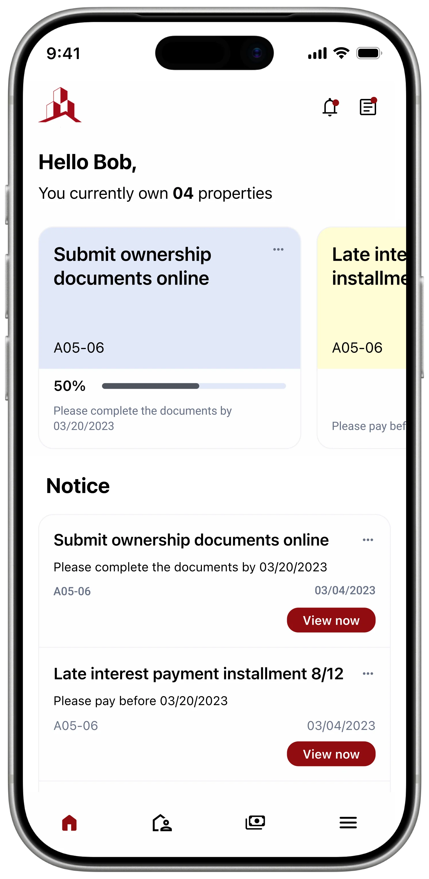
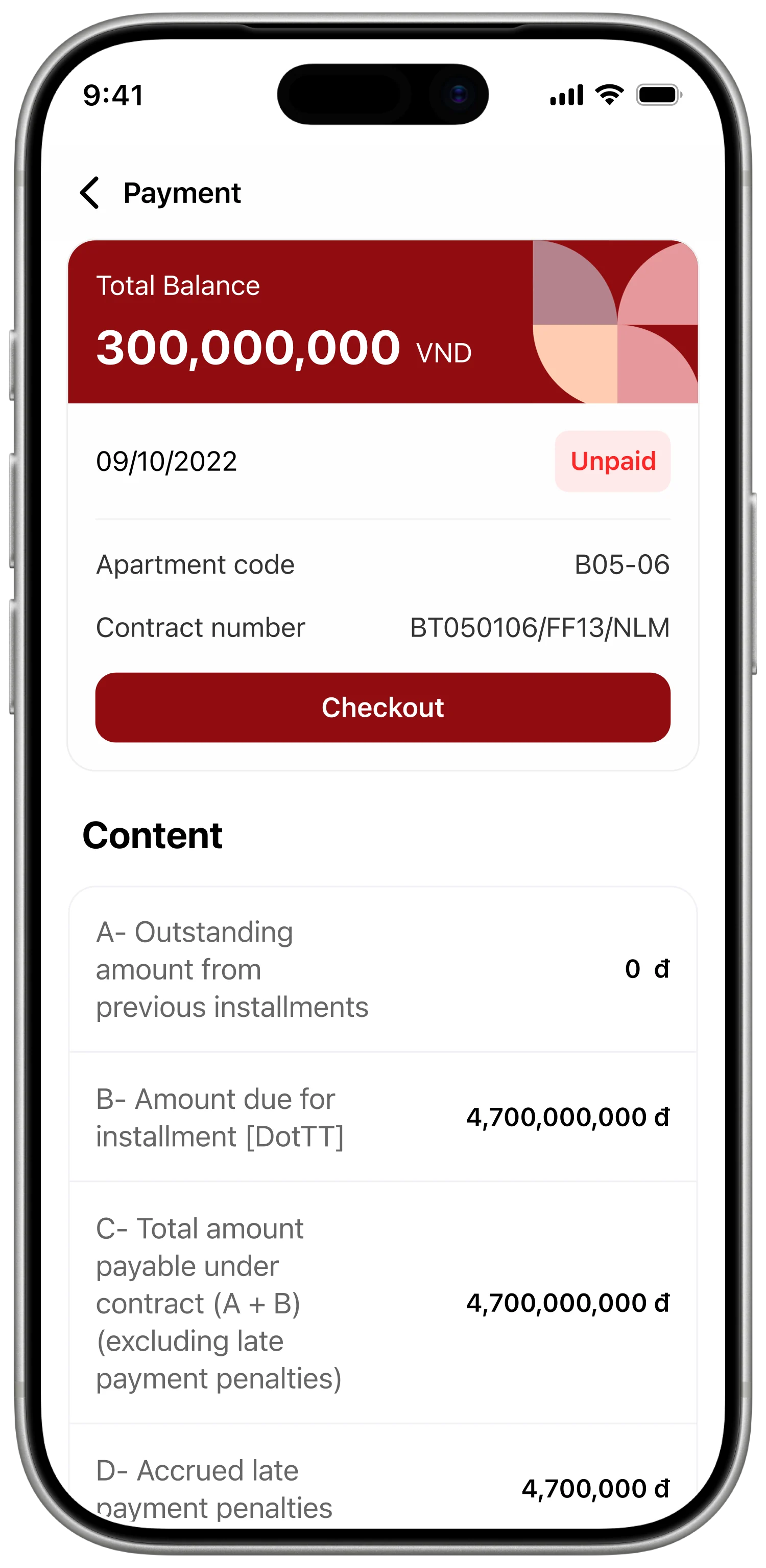
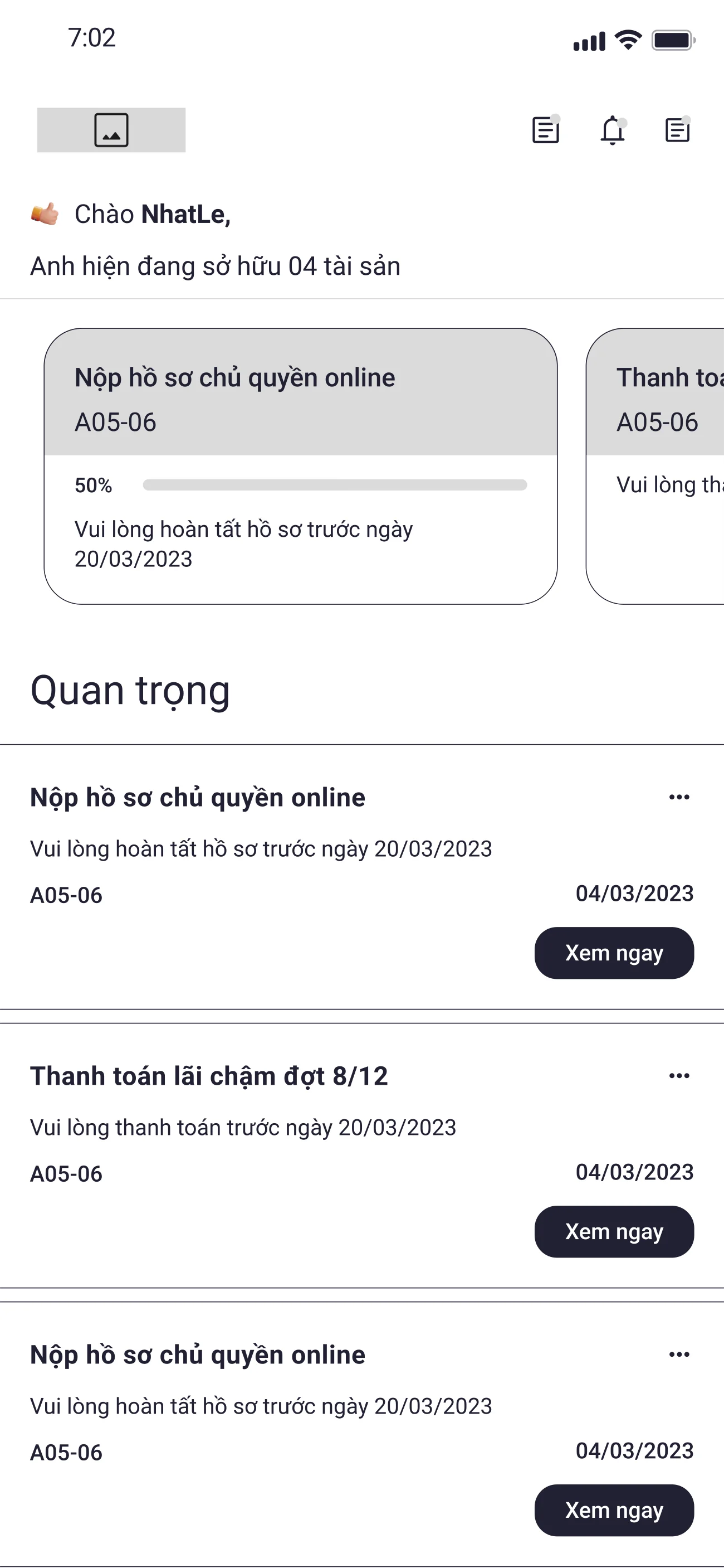
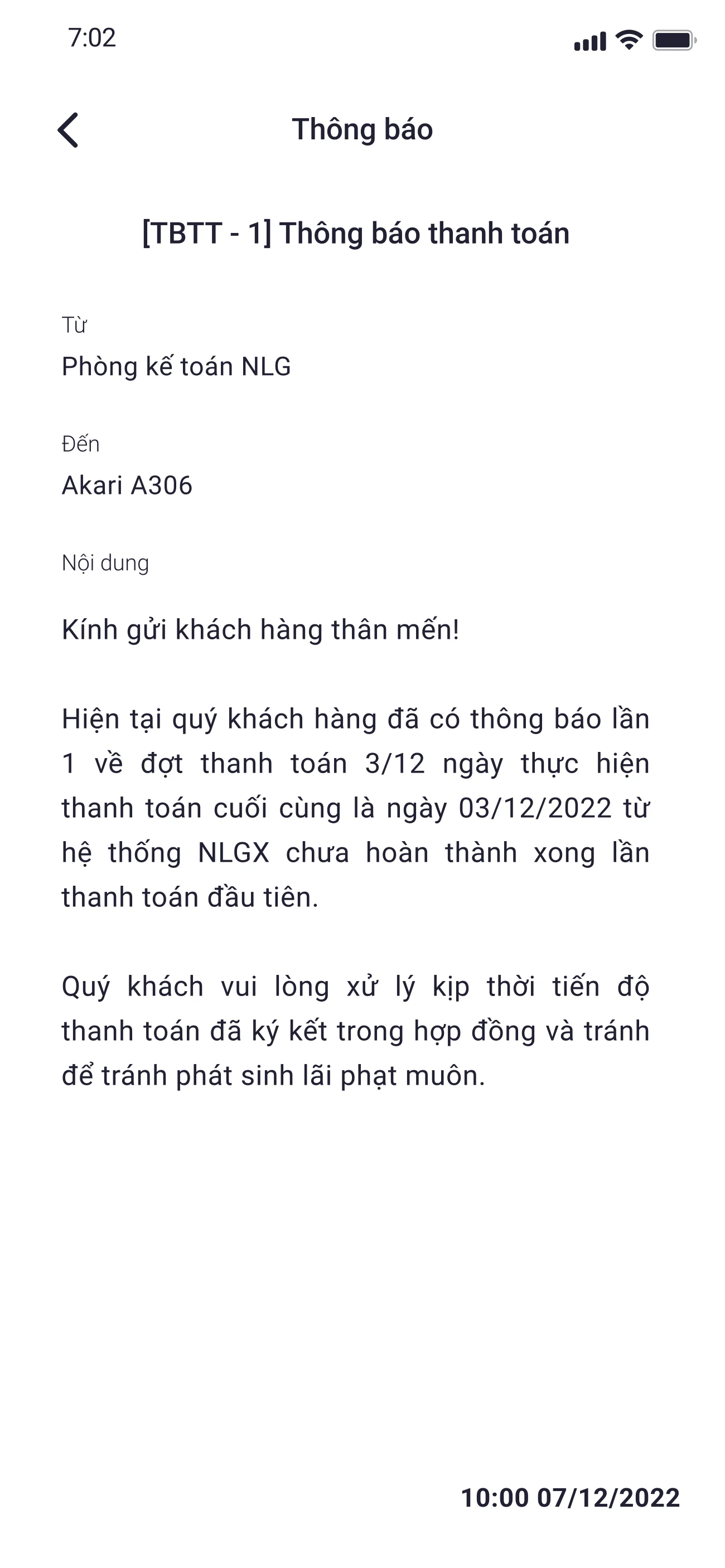
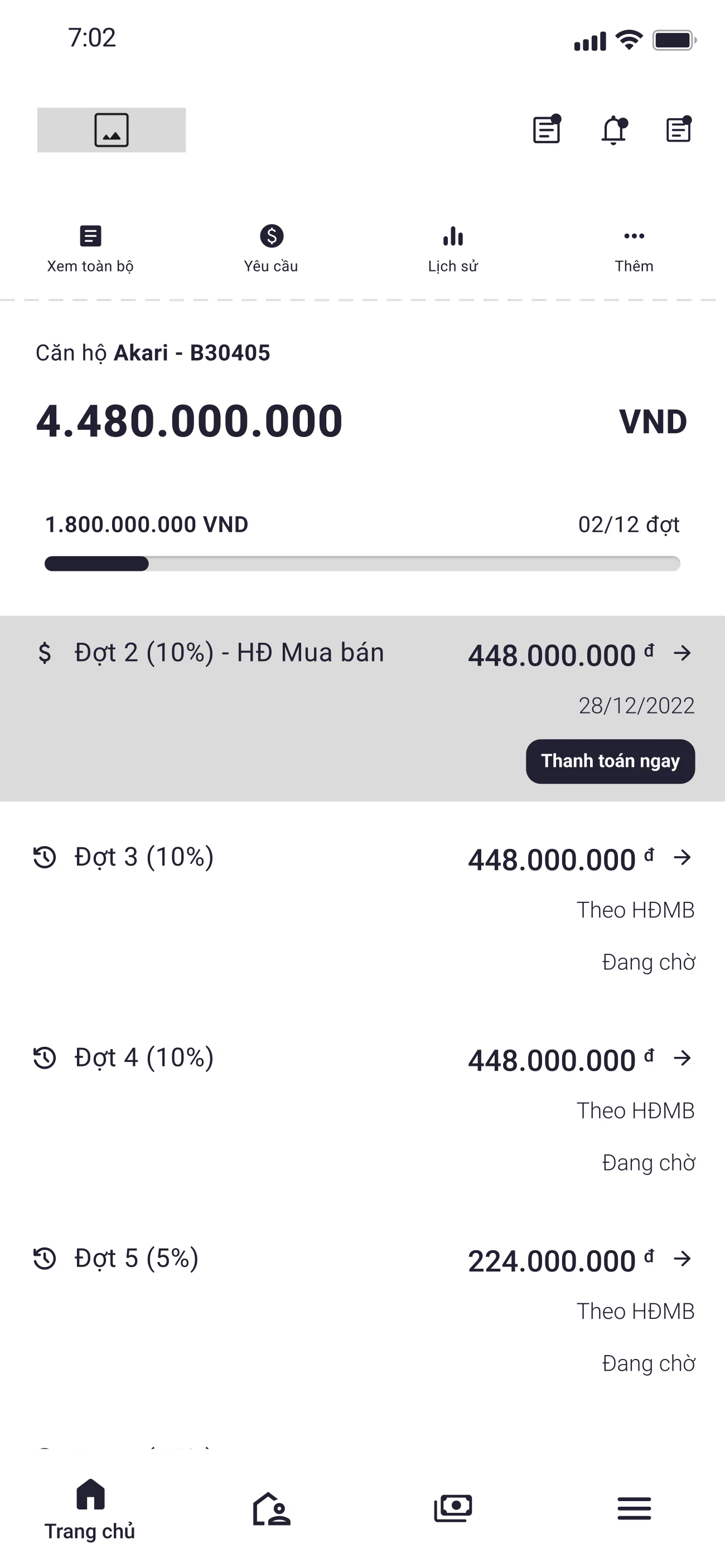
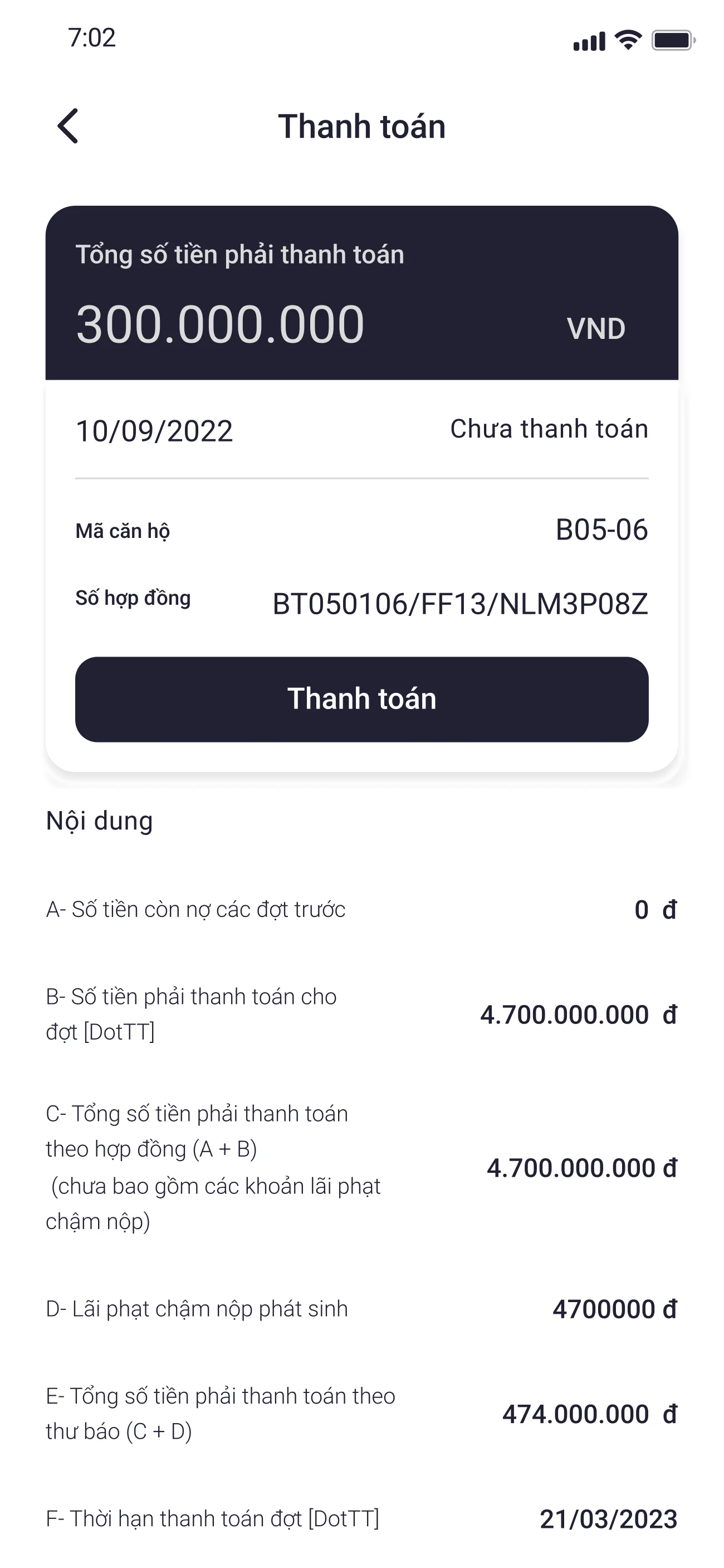
Visual payment tracking with pre-written transfer messages
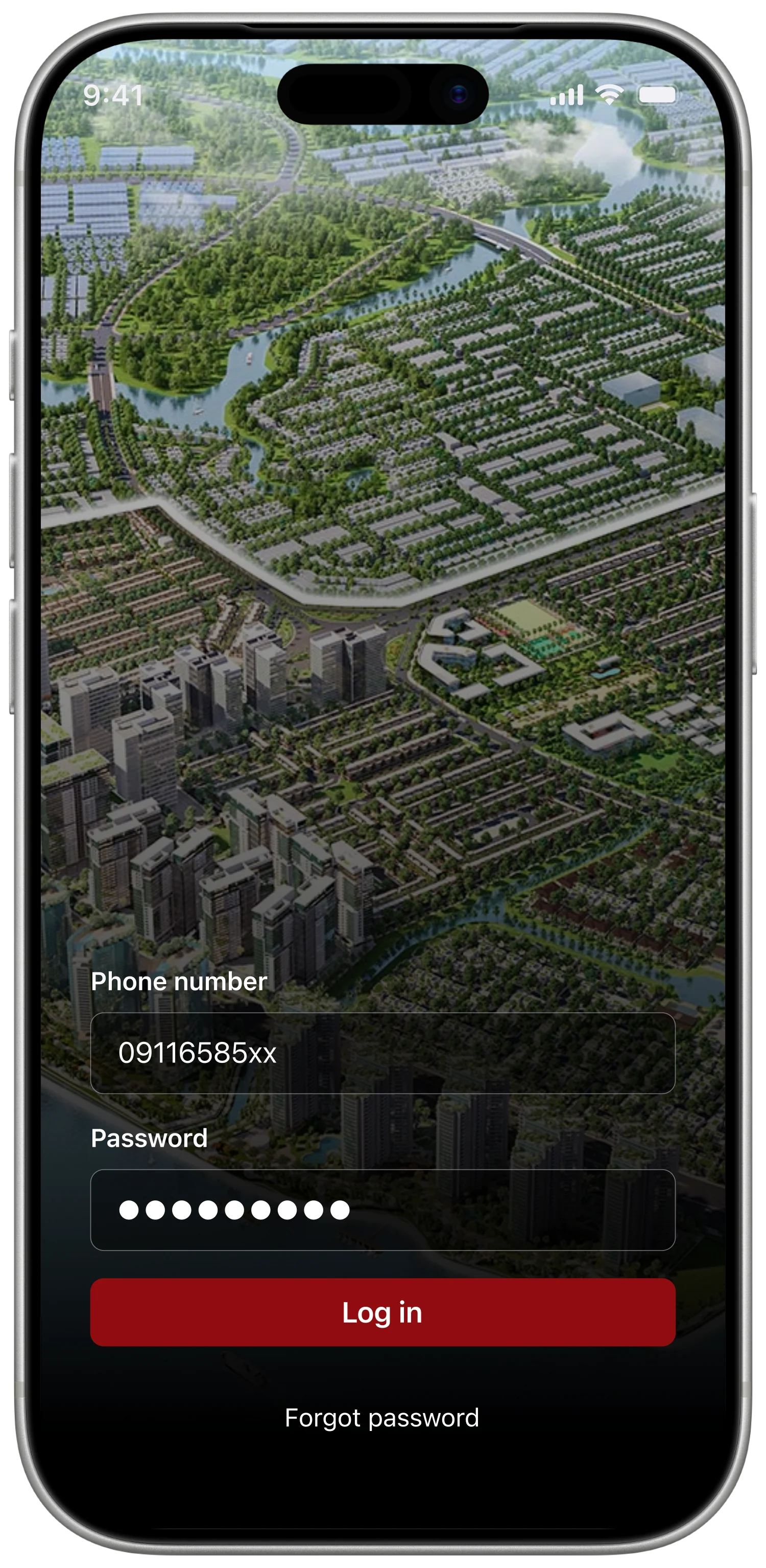
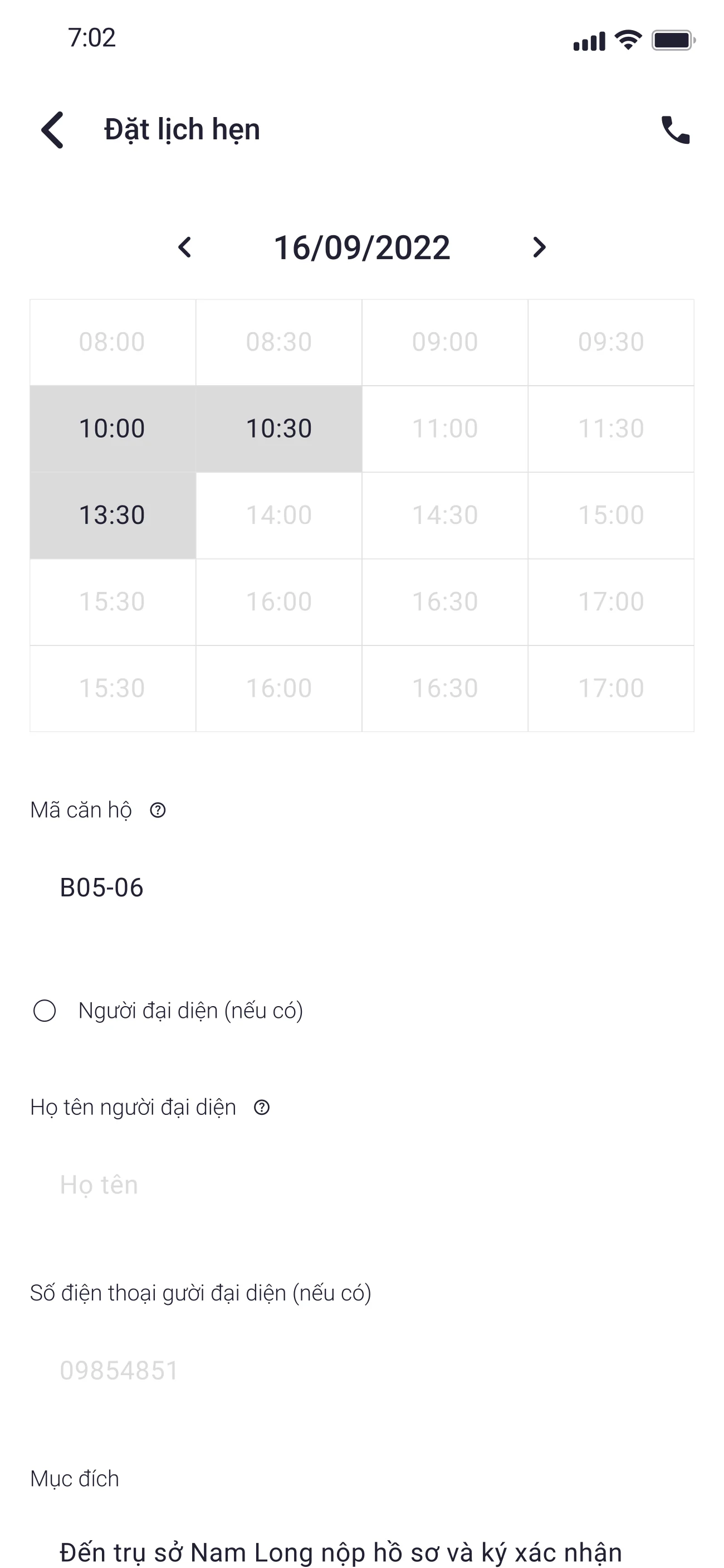
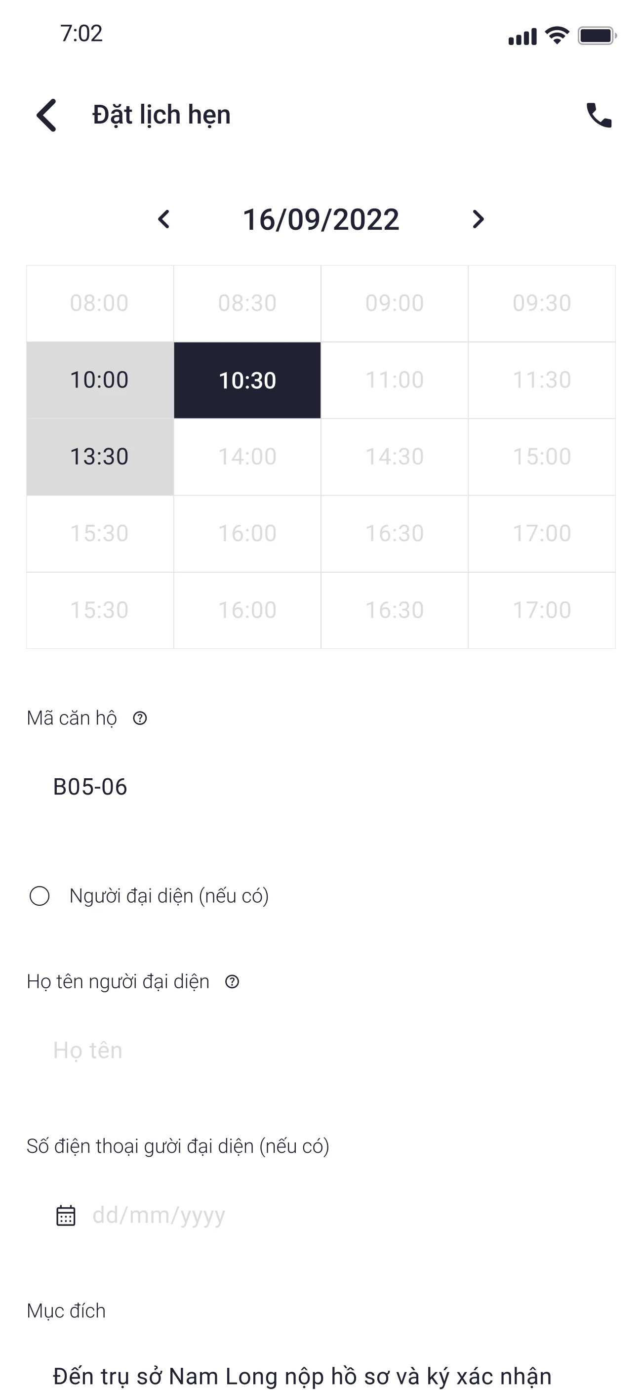
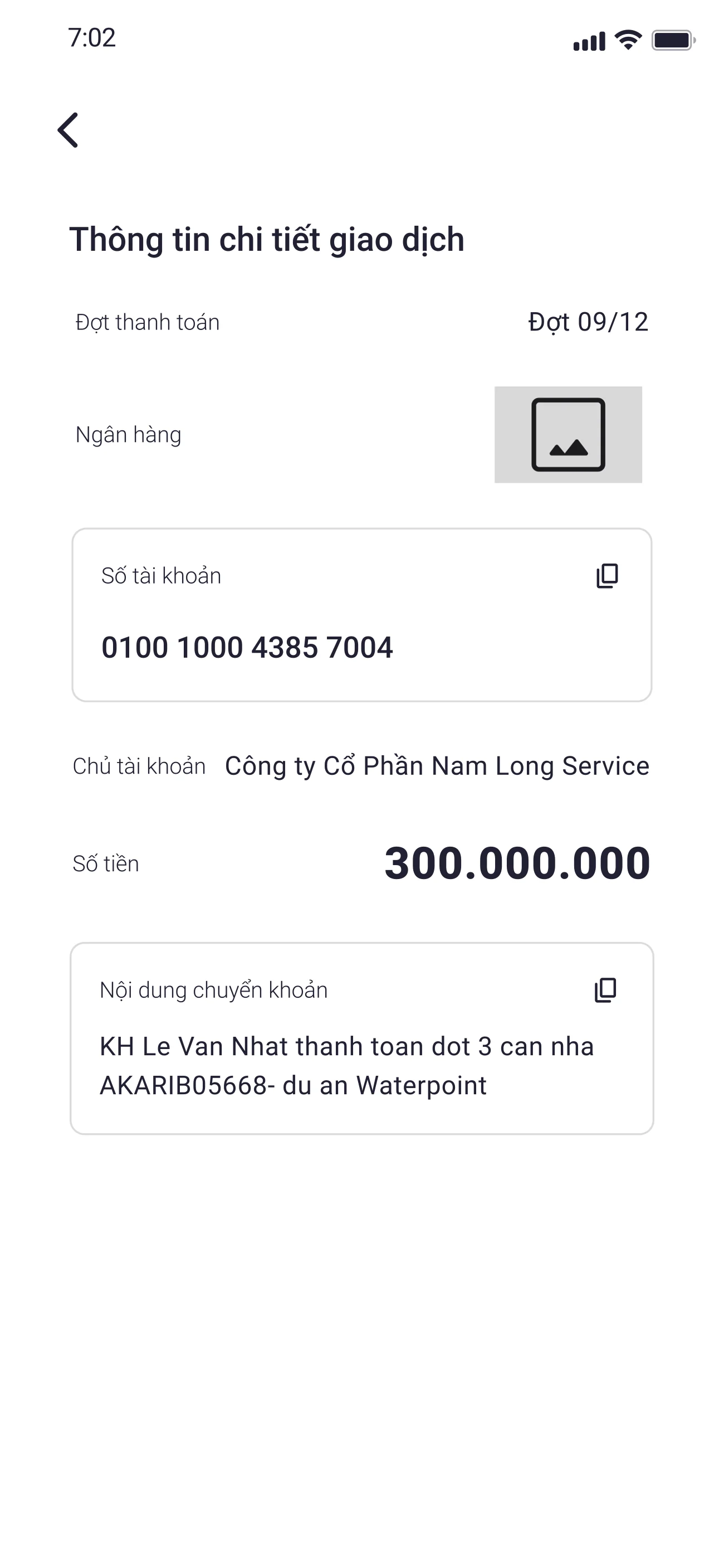
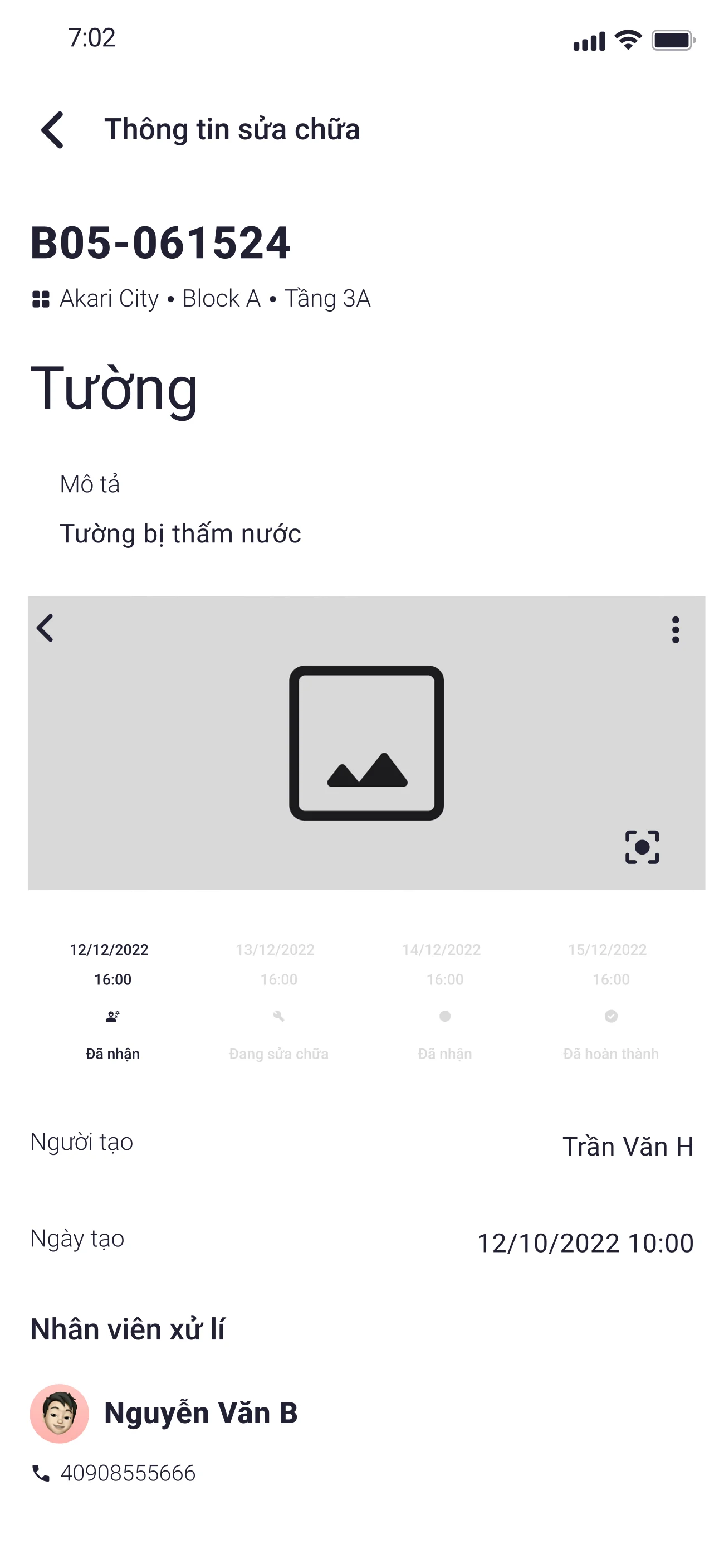
The top-ranked feature in the survey was payment tracking, and the top-ranked anxiety in the interviews was sending an incorrect transfer message. I proposed a visual payment-stage tracker as the buyer's mental model, paired with a pre-written transfer-message detail screen — canonical syntax pre-filled (recipient, account, amount, reference code), one-tap copy. The buyer never composes the message themselves, because the cost of a typo is too high.
The finance and sales teams had to maintain a canonical message template per payment stage, and update it whenever the underlying account or reference convention changed. That was a real operational tax — but it removed the moment where 4 of 5 interviewees described being most afraid.
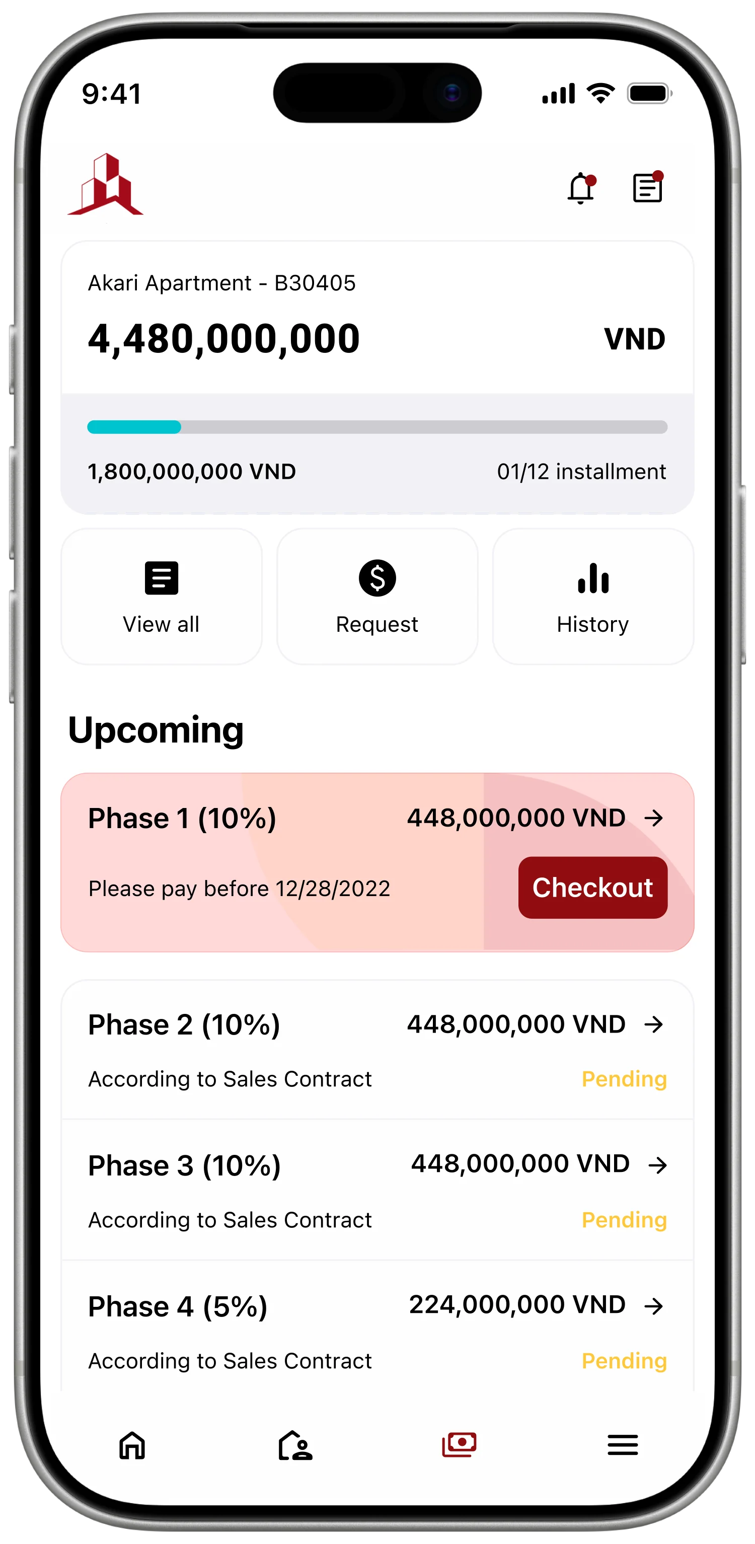
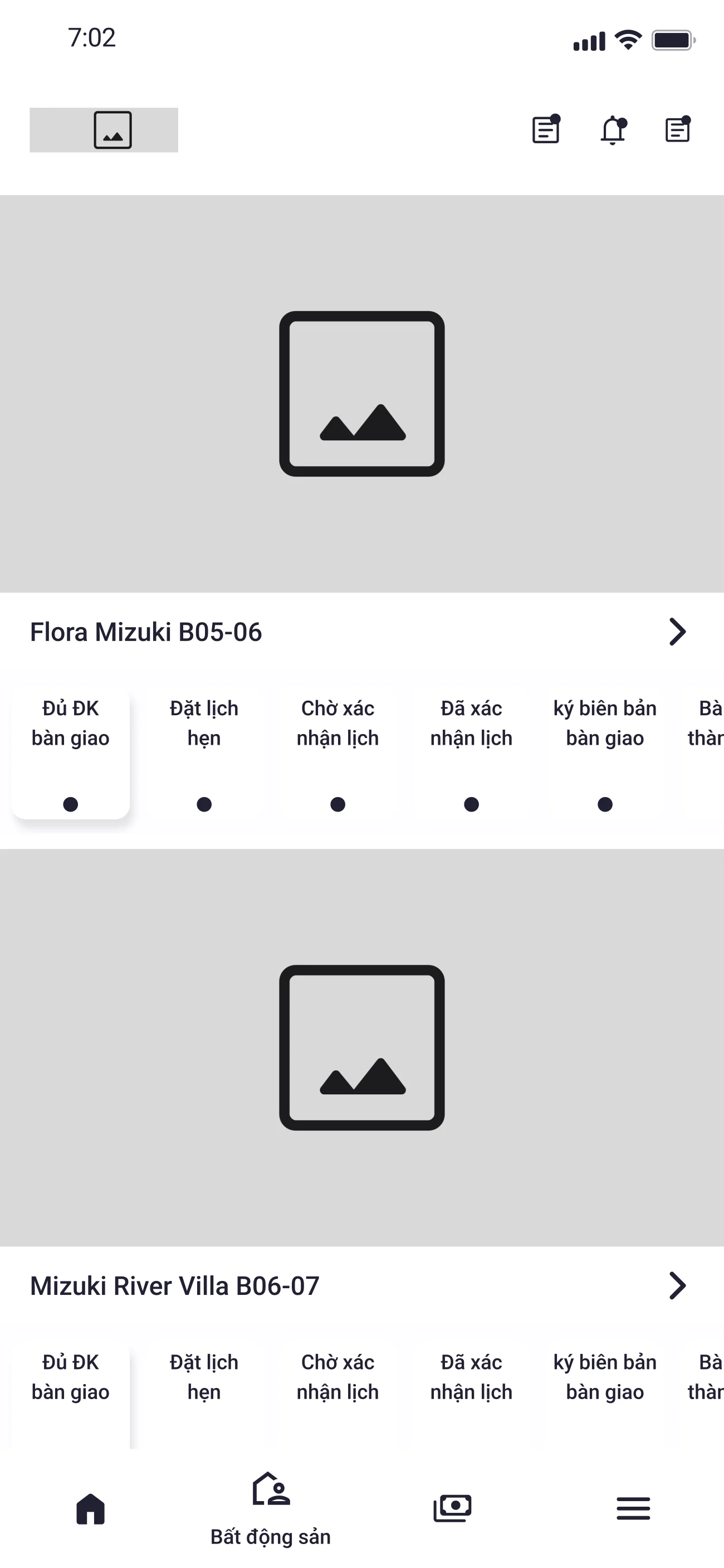
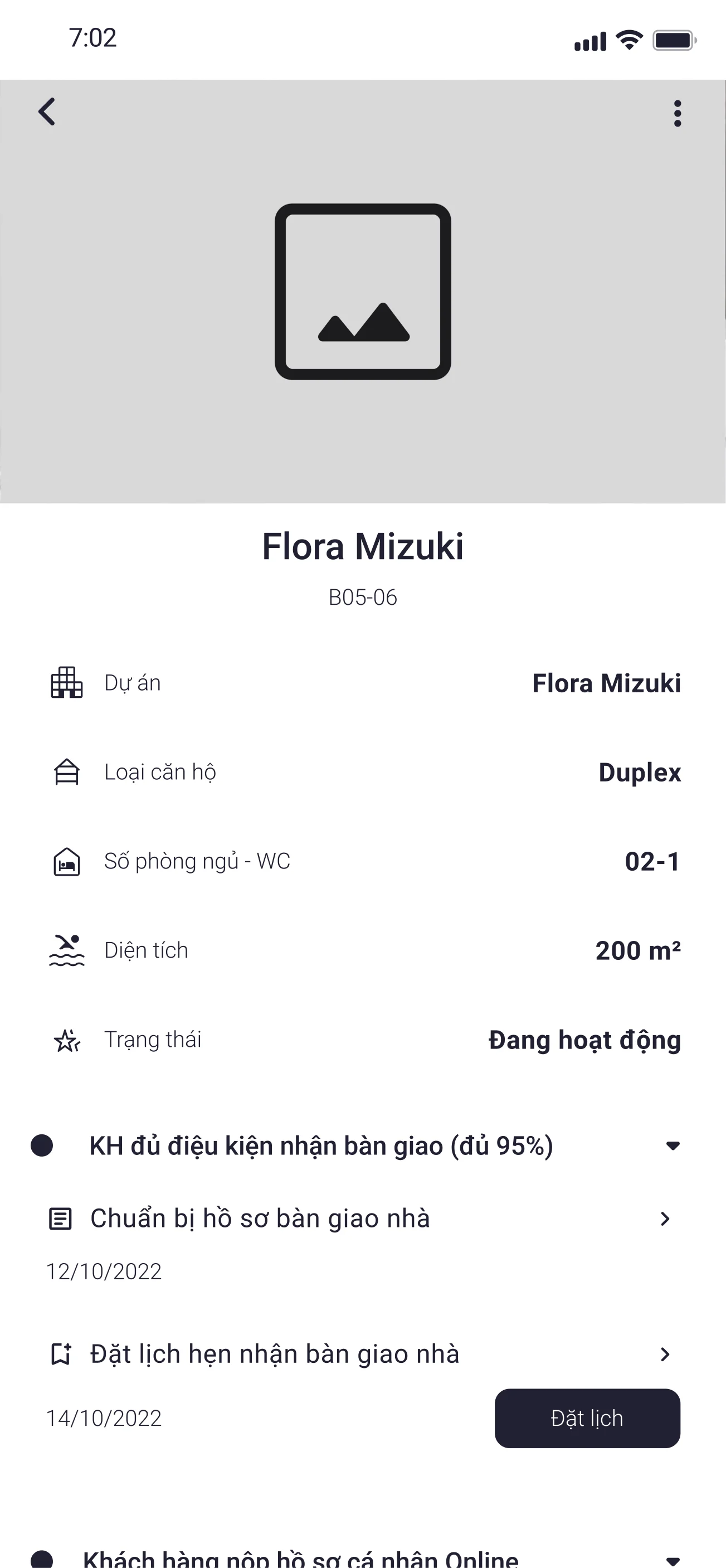
Payment timeline · the buyer’s mental model
A vertical timeline of every milestone — deposit, contract, instalments, handover, ownership — each marked Paid, Due, or Upcoming. The buyer always knows where they stand without asking sales or scrolling through email.

Pre-written transfer message · removes the typo risk
Recipient, account, amount, and reference code are pre-filled in canonical syntax. One-tap copy. A short banner explains why the syntax matters, so the buyer never types out a billion-VND transfer message.
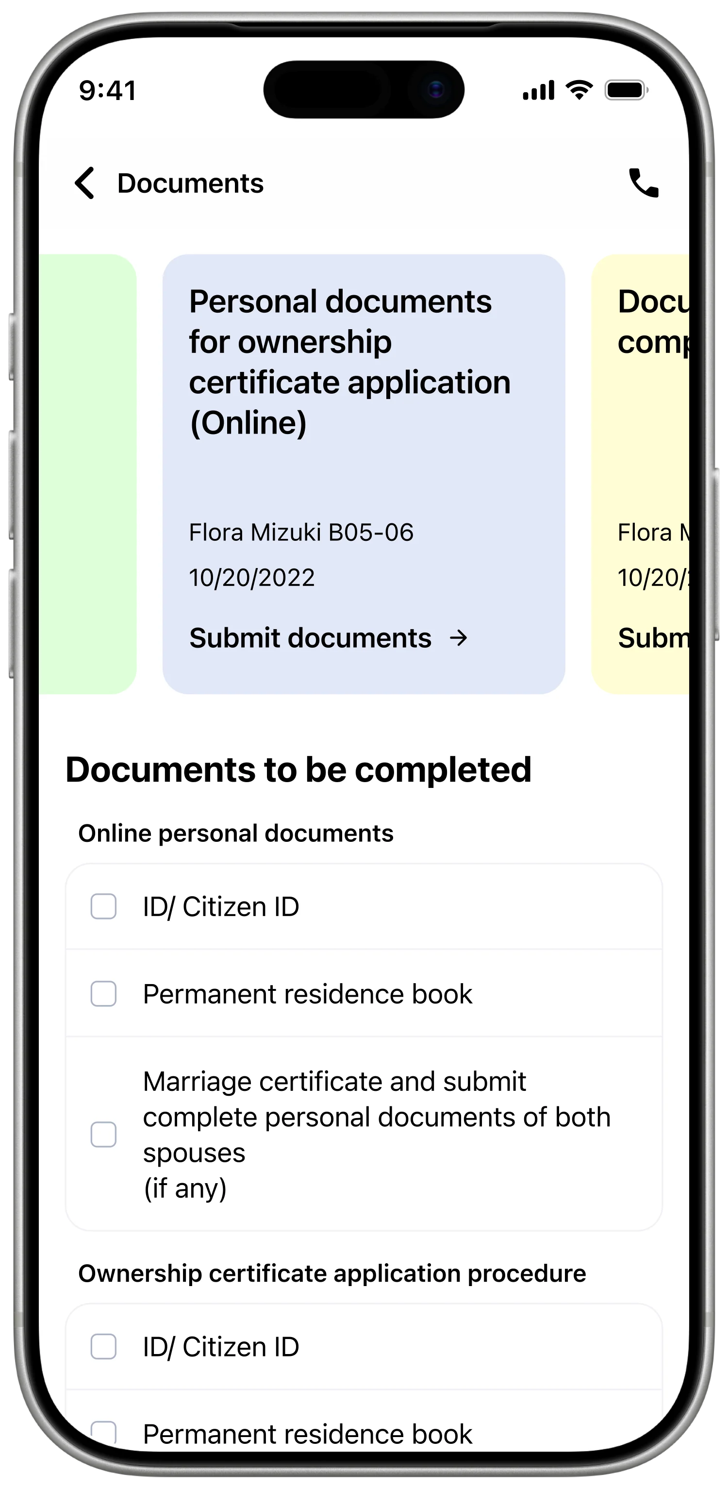
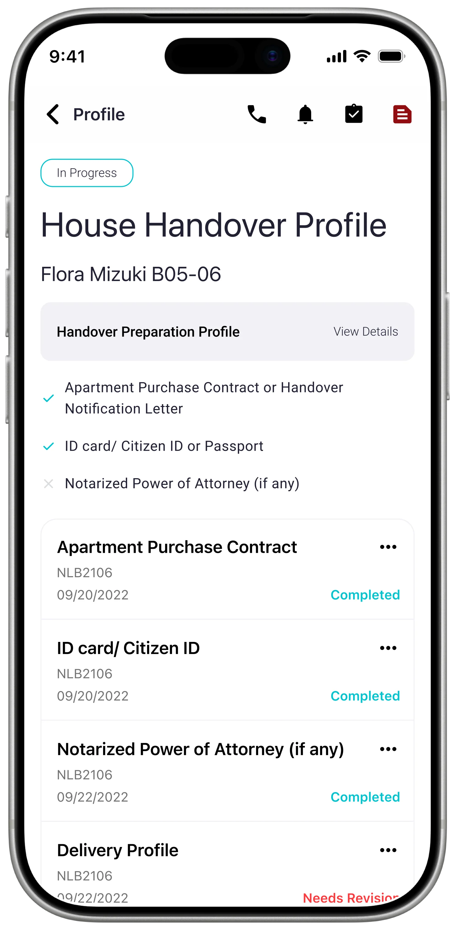
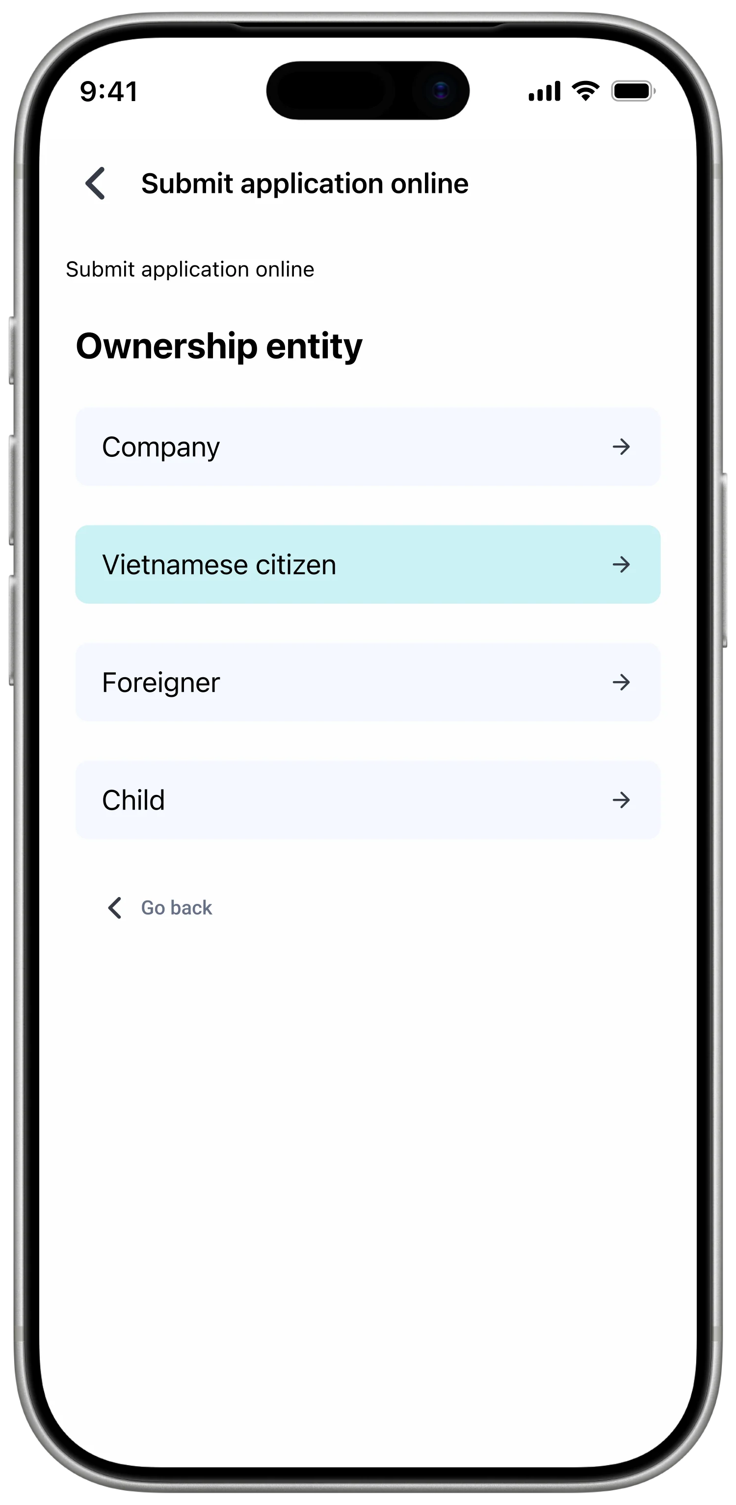
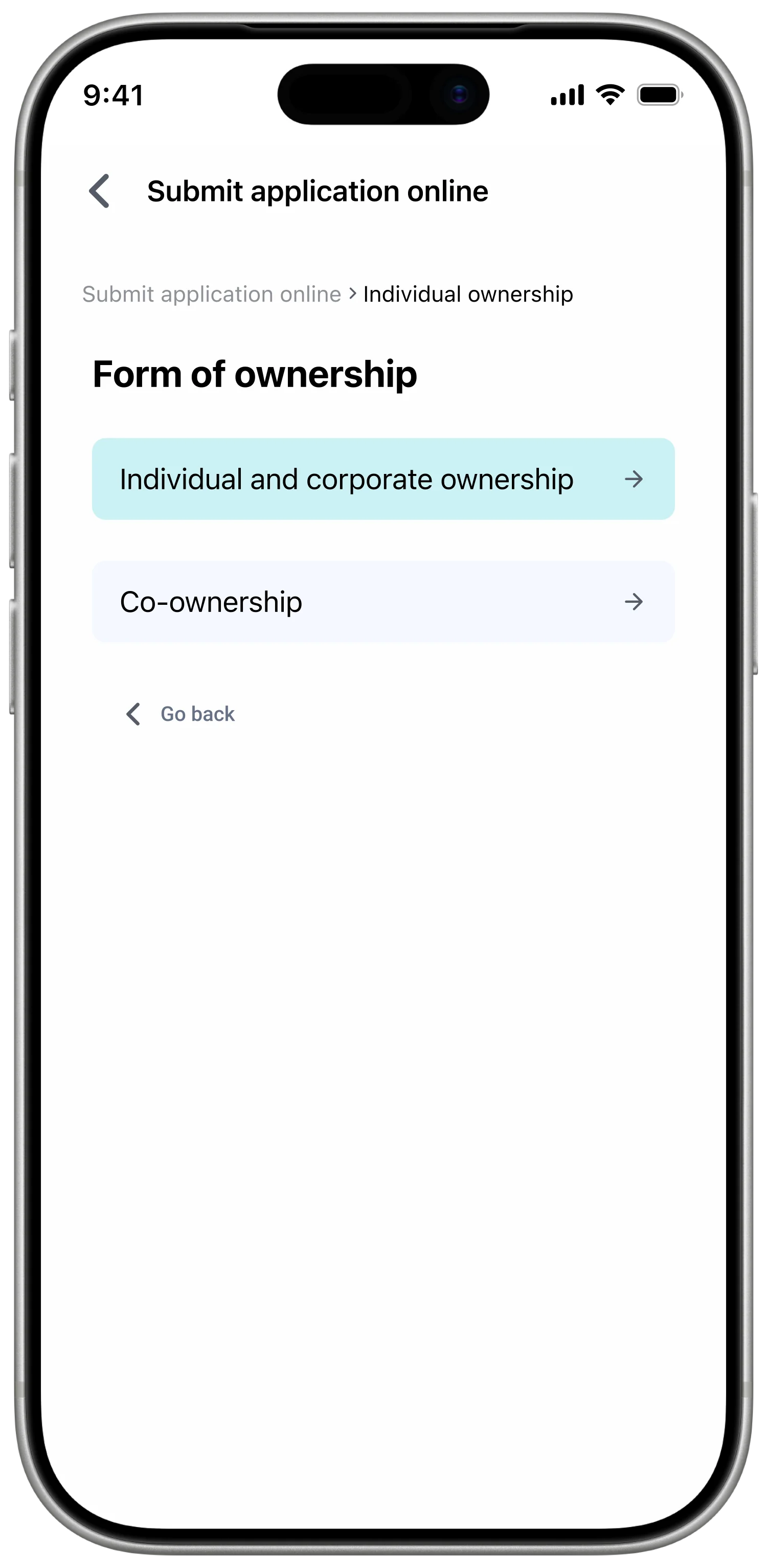
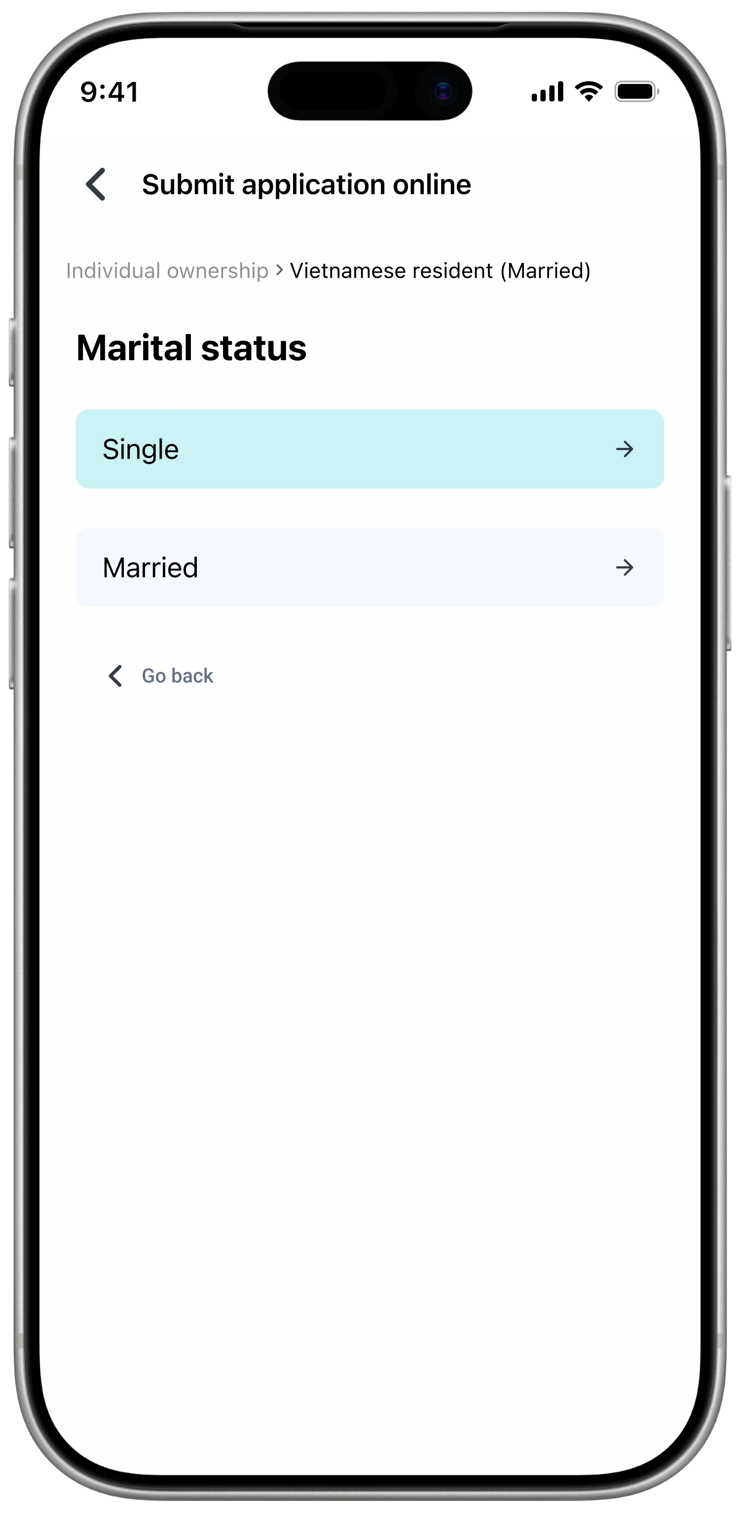
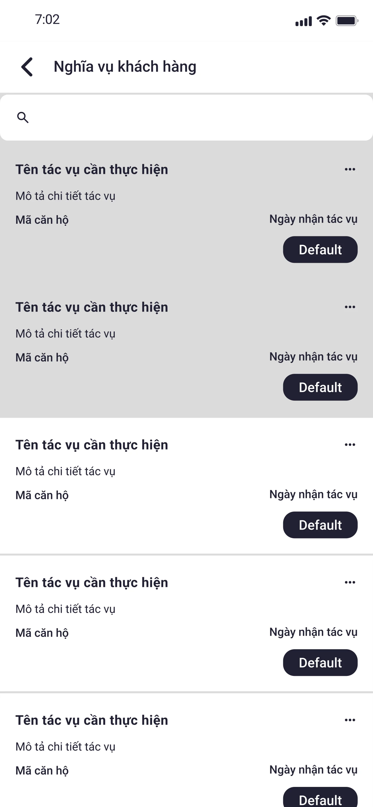
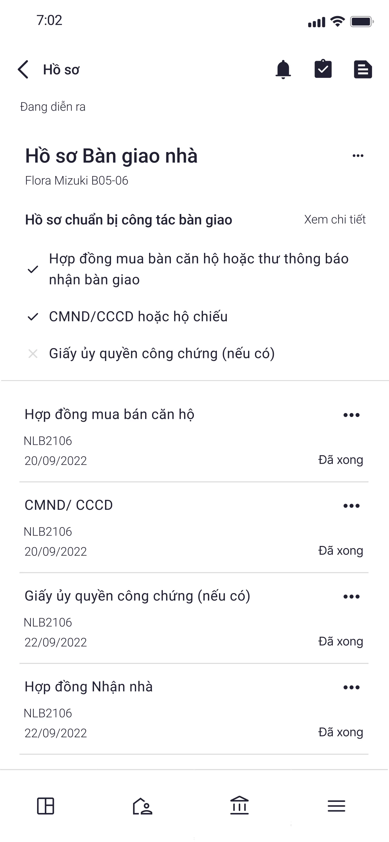
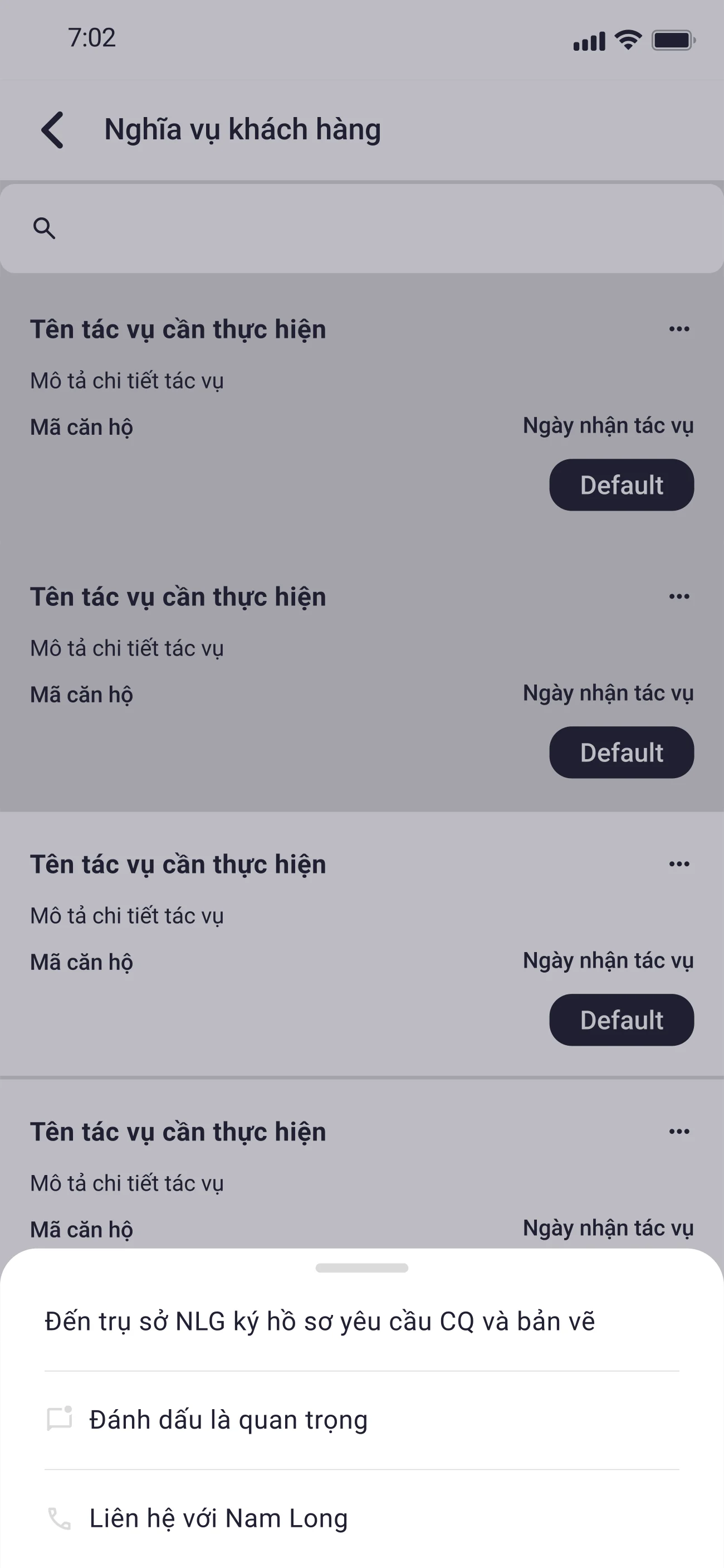
Online document submission with per-customer-type guidance
The customer journey showed a clear failure point at Submit document: incorrect or missing paperwork, travel between locations to fix it. I proposed an online submission flow that grouped documents by customer type (individual, corporate, co-buyer) and surfaced per-document guidance — required fields, sample images, a guided capture flow — so first-time buyers could complete the submission in one pass instead of returning to a counter.
Doubled the editorial work — every document type now needed a guided path written in plain language for first-time buyers, and a sample image taken — but eliminated the journey stage where buyers travelled between three locations to submit a single packet.
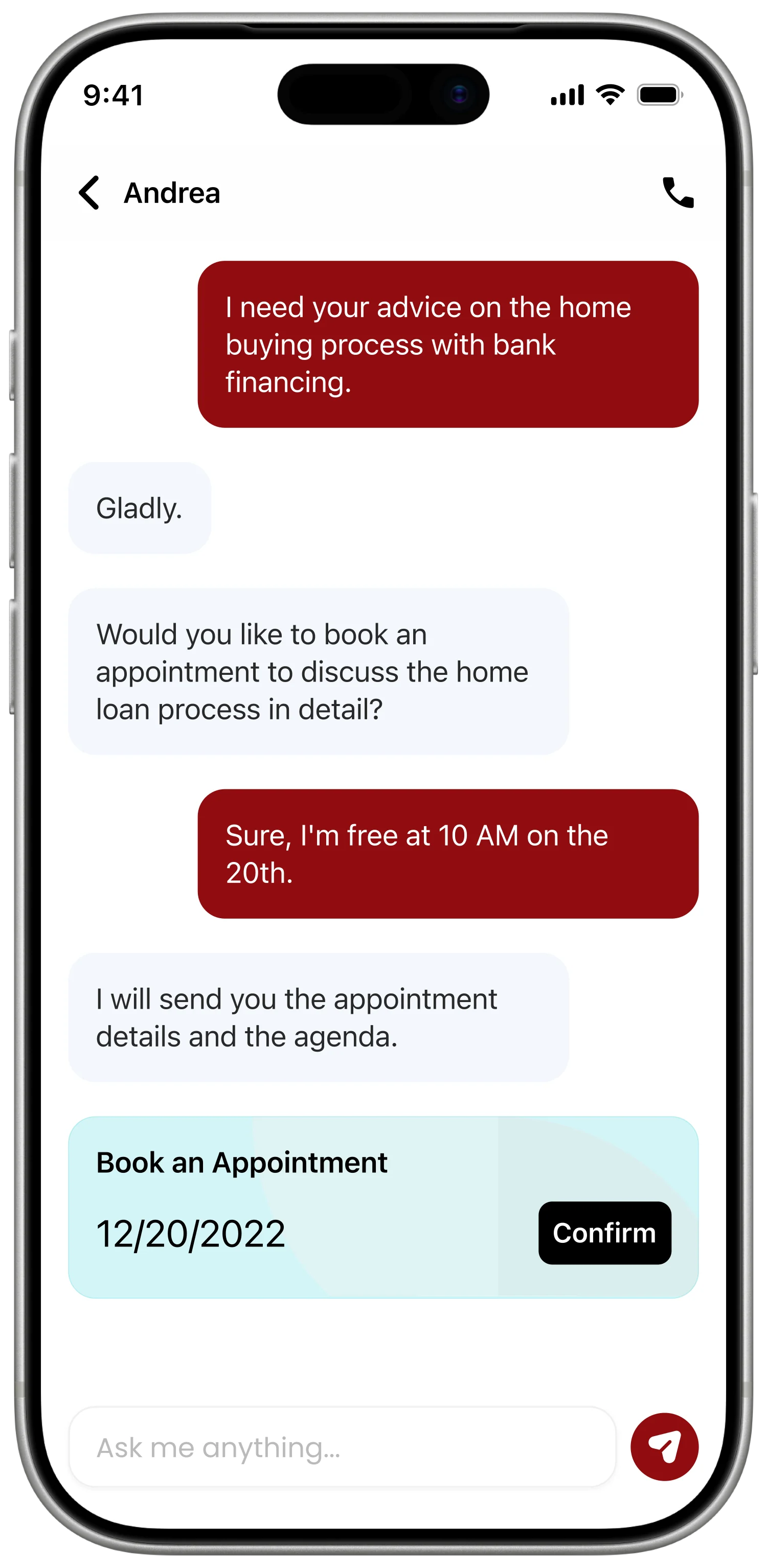
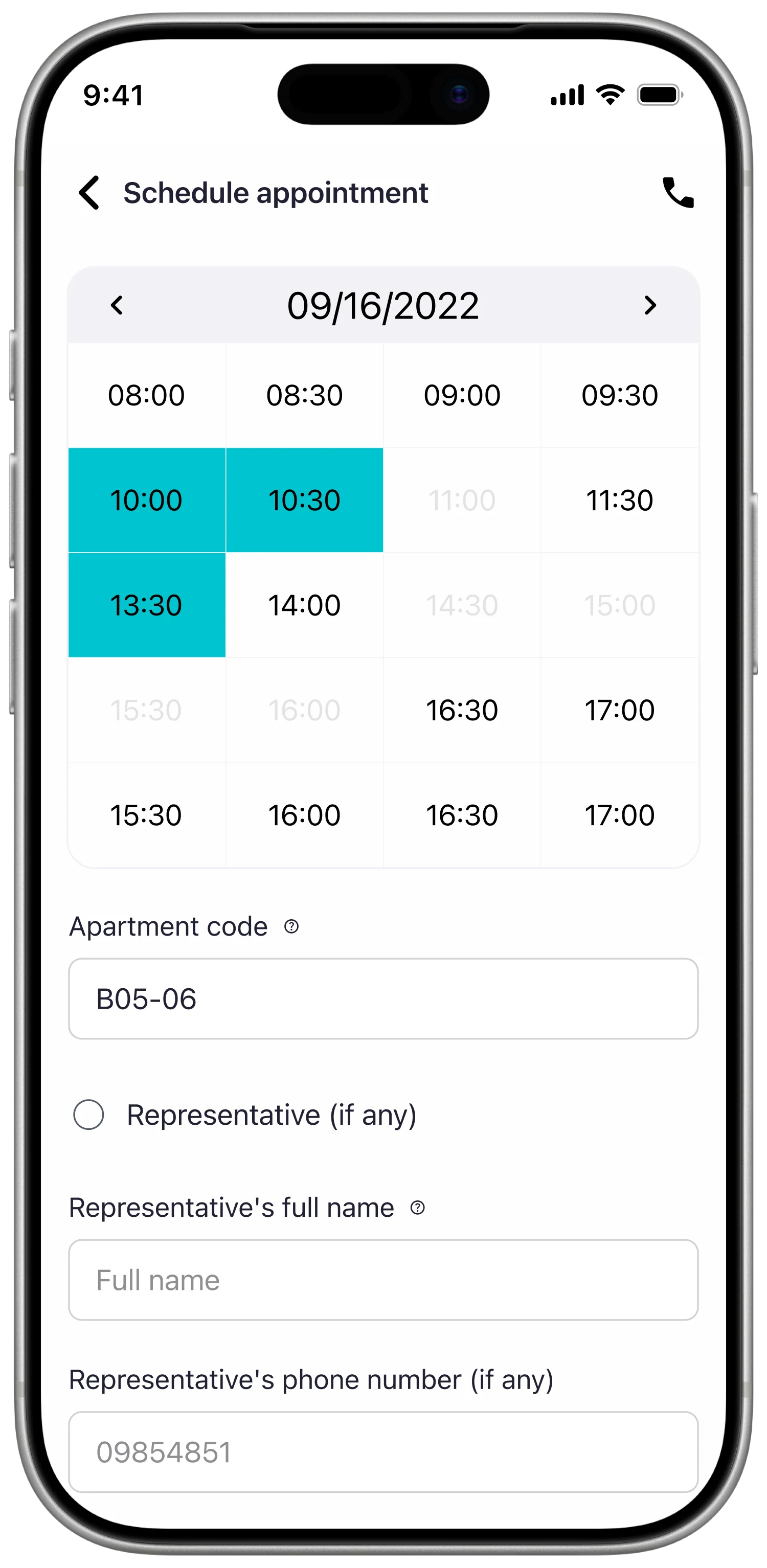
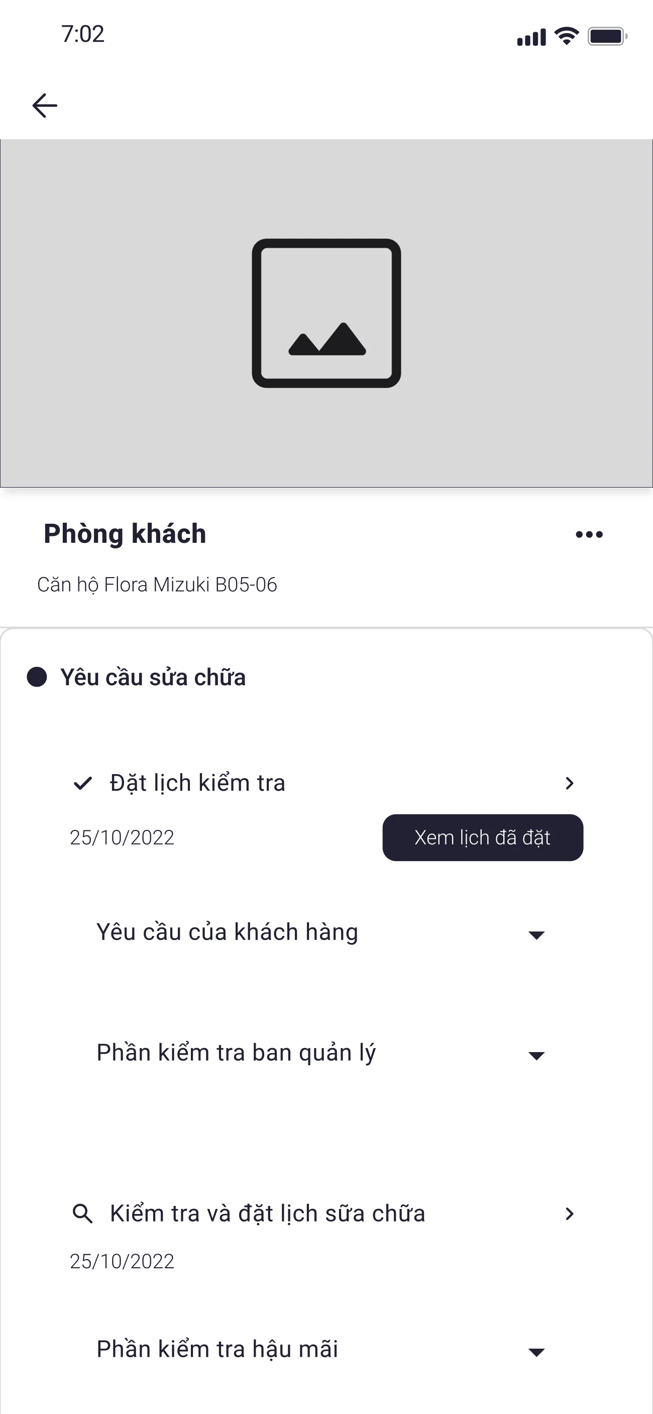
Smart appointment booking + in-app chat to bypass the busy hotline
The hotline was the single most frustrating touchpoint in the empathy map and the journey map. Rather than try to fix the hotline, I proposed an alternative path — appointment booking with the assigned customer-service rep, plus an in-app chat thread for shorter questions. Quick-reply suggestions tied chat into the same actions the user was already in (schedule appointment, resend transfer message, upload missing document).
Required the customer service team to staff a chat channel they didn't have before, and to commit to appointment slots ahead of demand. The cost was real staffing change — but it stopped the hotline-busy frustration at the point of need, instead of asking the user to wait through it.
Execution
Before any visual design landed, every module was sketched as low-fidelity wireframes. The point was not to make the screens look right — it was to make the navigation, hierarchy, and decision moments survive a first read with no styling to fall back on.
Wireframing
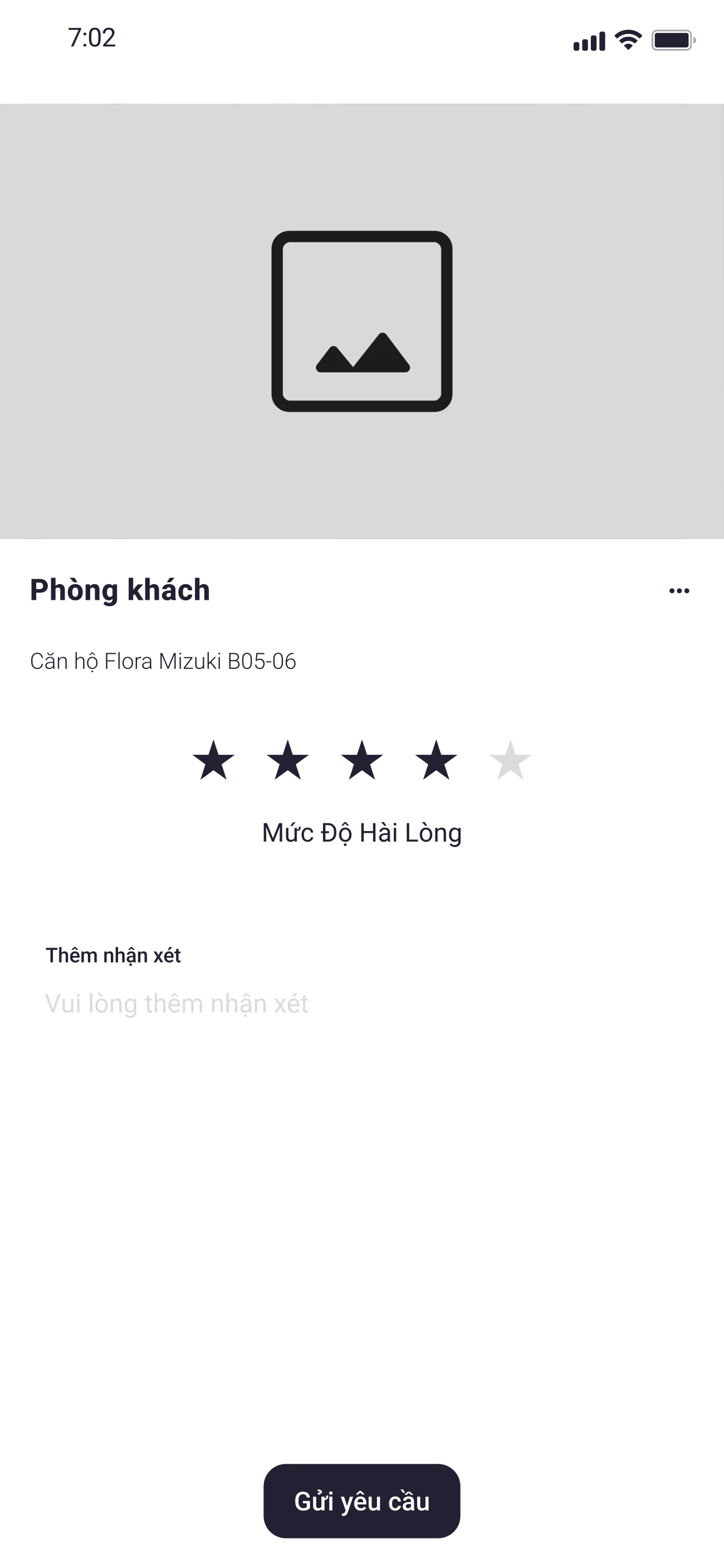
16+ wireframes across the 4 modules — Payment, Ownership, Handover, Maintenance — plus the cross-cutting surfaces (home, mailbox, profile, appointment booking, warranty process). The carousel below auto-scrolls; hover to pause, drag to scrub through the set.

Design system
Across the four modules — Payment, Ownership, Handover, Maintenance — I built one design system intended to extend to every other product in the Houseplus ecosystem. 25+ UI elements, Poppins type scale, a soft-blue surface (#F5F8FF) for the calm reading register, and a small set of components (StatusPill, TimelineRow, MessageCard, AppointmentSlot, DocumentRow) that carried the post-purchase narrative across screens.
A note on the design system: it was built without dedicated time and without a senior designer or mentor to guide it. The result is functional but not at the bar I hold myself to today — a useful baseline for the work that came next, not a benchmark.
Typography · Roboto
Display
Headline
Title
Body
Label
Color · derived from #910D10
Status
Surfaces
Text
Outcome
The product shipped to pilot deployment at Nam Long Group. Full production rollout status and post-launch metrics were not communicated back to the design team, so the artefacts I can speak to with confidence are the ones produced inside the engagement — the empathy map, the customer journey map, the PRD, the design system, and 70+ screens across the four modules.
The lessons I took from this project are practical, and most of them are about restraint. When a research finding contradicts the brief, lead with the research, not the brief. When a survey says the top-wanted feature is payment tracking, design the rest of the product so payment tracking is the centre of gravity, not just one tab among four. And when post-launch metrics never reach the design team, the artefacts still have to be honest — about what was learned, what was designed, and what was not validated downstream.